Unlock a world of possibilities! Login now and discover the exclusive benefits awaiting you.
- Qlik Community
- :
- Blogs
- :
- Technical
- :
- Design
- :
- Enhancing the User Experience Using Conditional Ex...
- Subscribe to RSS Feed
- Mark as New
- Mark as Read
- Bookmark
- Subscribe
- Printer Friendly Page
- Report Inappropriate Content
As QlikView developers, one of our main focuses is on the user experience. There are many instances where objects only need to be shown upon the user’s request. An example of this is list boxes (filters). With the use of conditional expressions, a QlikView developer can make the list boxes available when the user needs them.
I have seen too many applications where list boxes take up most of the design area available to the developer. Invariably you get the same response, “It is what the users want”. And while I am sure they “need” all of the list boxes, they just do not need them on the screen the entire time. So how do you get around this demand for list boxes? Create a “Filters” button and have the user show and hide the list boxes whenever they want.
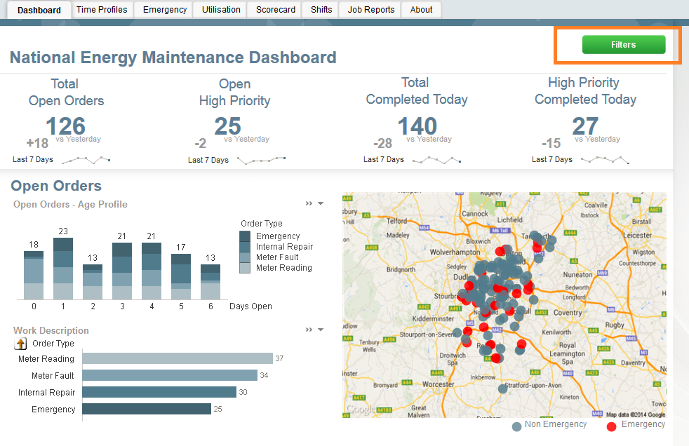
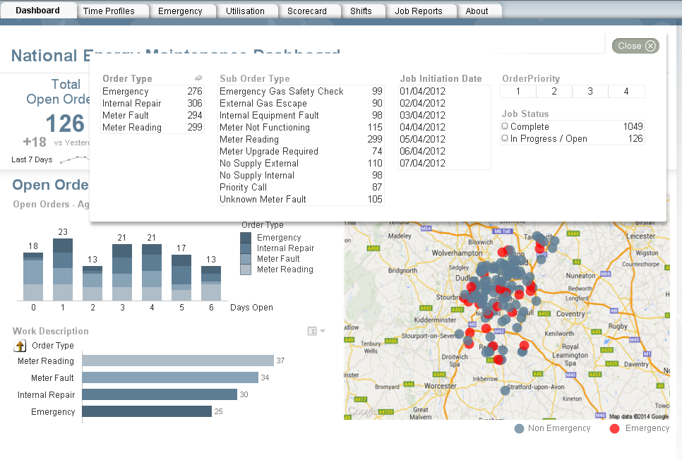
For this first example, I will reference the Workforce Management demo. On the dashboard below there are no visible list boxes. The lack of list boxes opens up more space to the developer. Instead of making the list boxes available at all times, we have a Filters button which, when invoked, will display the filters over top of the visualizations. Once the user makes the appropriate selections, he/she can close the filter panel and continue with his/her discovery. This is done by setting a variable and conditionally showing the objects based on the current value of the variable. The beauty of this approach is that the user gets to have the filters that he/she needs and the developer does not lose any display area.
Here you can see the filter button with a conditional show. When invoked, there is an action to change the variable to 1 which makes the filters button disappear and makes the filter objects appear.


All of the filter objects have the same show conditional. When the user selects the close button, the variable is changed back to 0 which makes the filter objects disappear and the Filters button reappear.


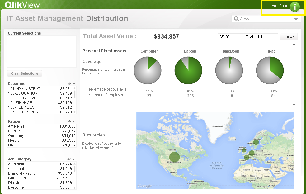
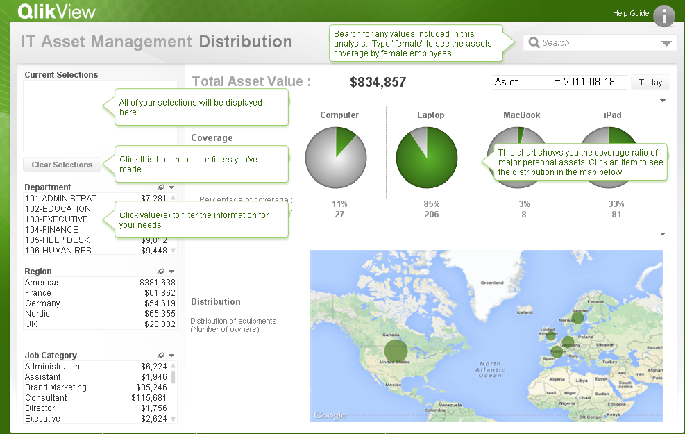
This approach can also be used if you need to show/hide help/information pop-ups as shown here in the IT Asset Management demo.


If you would like to see how the filter and the help/information buttons were developed, the QVWs can be downloaded from the demo site. As was stated earlier, the filter example referenced the Workforce Management demo and the Help/Info button referenced the IT Asset Management demo. Happy Qliking!
- « Previous
-
- 1
- 2
- 3
- Next »
You must be a registered user to add a comment. If you've already registered, sign in. Otherwise, register and sign in.