Unlock a world of possibilities! Login now and discover the exclusive benefits awaiting you.
- Qlik Community
- :
- Blogs
- :
- Technical
- :
- Design
- :
- What’s new in Qlik Sense 3.0 – Bubbles (Visual Dat...
- Subscribe to RSS Feed
- Mark as New
- Mark as Read
- Bookmark
- Subscribe
- Printer Friendly Page
- Report Inappropriate Content
Creating a reliable data model becomes in one of the key factors to a successful project, data visualization, chart, dashboard, or report. Quite a few times creating an effective model is not the easiest task to perform due several reasons, poor data quality, or unstructured data sources, etc.
Even when we have a pristine normalized data model we may face some issues on how to associate our data easily.
To help us with the crucial mission of managing data associations from multiples sources and building a great data model Qlik Sense 3.0 (sorry QlikView fans) release included the so called "bubbles" feature.
How it works?
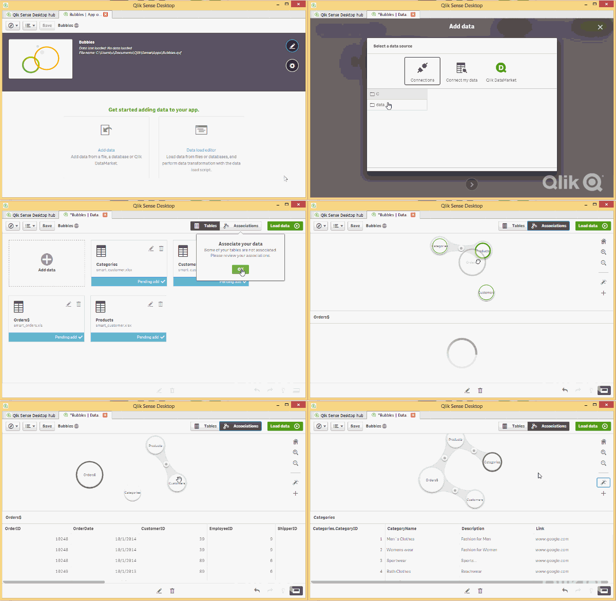
All this works through Qlik Data Manager, when more than one table is loaded we can access to the association's view where a circle or a bubble symbolizes each one of the loaded tables. The size of the bubble represents the table’s size so the larger the bubble the more rows of data it contains.
The fun part is to interact with the bubbles, you can click one and explore its contents, or you could click and press on a bubble and see how Qlik Sense will recommend you possible associations using color coding. Highly recommended associations are marked with green, and medium recommendations are orange.
To confirm an association you just need to drag one bubble to another table and see the magic happen. It not only will capture and match the column with identical names but it will also scan the data content to suggest you with the best possible link.

If you want to get more control you can always edit or break the suggested associations and use your criteria to set up a custom association. Alternatively users can let Qlik Sense create associations between all added data tables according to recommendations based on data analysis by clicking on the magic stick icon.
Once you’re happy with your data model just press on Load Data button and you’re good to go.
For a more comprehensive demo and demo sample files please check out Michael Tarallo material here.
Enjoy Qliking
AMZ
You must be a registered user to add a comment. If you've already registered, sign in. Otherwise, register and sign in.