Unlock a world of possibilities! Login now and discover the exclusive benefits awaiting you.
- Qlik Community
- :
- Forums
- :
- Analytics & AI
- :
- Products & Topics
- :
- App Development
- :
- Add Y/LY value as lable in a Pie chart?
- Subscribe to RSS Feed
- Mark Topic as New
- Mark Topic as Read
- Float this Topic for Current User
- Bookmark
- Subscribe
- Mute
- Printer Friendly Page
- Mark as New
- Bookmark
- Subscribe
- Mute
- Subscribe to RSS Feed
- Permalink
- Report Inappropriate Content
Add Y/LY value as lable in a Pie chart?
Hi,
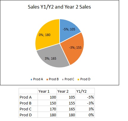
My business just love theire Pie Chart showing not only shares and value but also the difference from Last Year, see pic.
Do you have any good ideas how to visualize that using a Pie Chart - Qlik Sense of course.
I (We) have tried several methods and other Graphs but do not really get it as powerfull as below - and as demanded by business.
- Mark as New
- Bookmark
- Subscribe
- Mute
- Subscribe to RSS Feed
- Permalink
- Report Inappropriate Content
could u attach sample qvf?
- Mark as New
- Bookmark
- Subscribe
- Mute
- Subscribe to RSS Feed
- Permalink
- Report Inappropriate Content
Thanks for respons - here you go - see comment in app
- Mark as New
- Bookmark
- Subscribe
- Mute
- Subscribe to RSS Feed
- Permalink
- Report Inappropriate Content
Hello,
Not possible with standard Qlik Sense Pie object.
Possible in QlikView with dual() function. Qlik Sense ignores that function while building labels.
If you hover over it pops up both values though. You can consider that as a work around as long as this project is not basically for mobile purposes.
BR
Serhan