Unlock a world of possibilities! Login now and discover the exclusive benefits awaiting you.
- Qlik Community
- :
- Forums
- :
- Analytics & AI
- :
- Products & Topics
- :
- App Development
- :
- Alternative Measure Dropdowns are styled weird in ...
- Subscribe to RSS Feed
- Mark Topic as New
- Mark Topic as Read
- Float this Topic for Current User
- Bookmark
- Subscribe
- Mute
- Printer Friendly Page
- Mark as New
- Bookmark
- Subscribe
- Mute
- Subscribe to RSS Feed
- Permalink
- Report Inappropriate Content
Alternative Measure Dropdowns are styled weird in Line Charts after April 2020 Update
Hello, I just upgraded to the April 2020 version of Qlik Sense and started noticing that my Line Charts were behaving strangely.
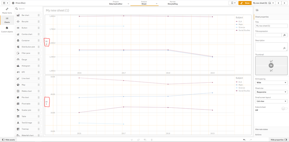
In this image I have two Line Charts. The first has one measure, and the second has a number of alternative measures. As you can see, the axis label is not displaying correctly on either chart. It is also worth noting that the first chart was displaying the axis label just fine until I added the second chart with alternative dimensions.
I've also noticed that sometimes when I change the second chart in some way, both charts display the measure labels correctly. This is also only happening for Line Charts, Alternative Measures on other charts do not have this problem it seems.
Is there something I am doing wrong? Or is this just an issue with this release?
EDIT: I've now confirmed that changing the Y-Axis from "Labels and Title" to "Labels Only" and then back to "Labels and Title" actually fixes the issue.
- Tags:
- line chart
- Mark as New
- Bookmark
- Subscribe
- Mute
- Subscribe to RSS Feed
- Permalink
- Report Inappropriate Content
I too face the same issue. Is there a solution which you came across?
- Mark as New
- Bookmark
- Subscribe
- Mute
- Subscribe to RSS Feed
- Permalink
- Report Inappropriate Content
Yup! Reverted our server back and updated to February 2020 instead 😁.
Sorry, I know that isn't really a solution but at the very least I can confirm it doesn't occur in February 2020.
