Unlock a world of possibilities! Login now and discover the exclusive benefits awaiting you.
- Qlik Community
- :
- Forums
- :
- Analytics & AI
- :
- Products & Topics
- :
- App Development
- :
- Bar Chart how to display percentage instead of raw...
- Subscribe to RSS Feed
- Mark Topic as New
- Mark Topic as Read
- Float this Topic for Current User
- Bookmark
- Subscribe
- Mute
- Printer Friendly Page
- Mark as New
- Bookmark
- Subscribe
- Mute
- Subscribe to RSS Feed
- Permalink
- Report Inappropriate Content
Bar Chart how to display percentage instead of raw value
Greetings Qlik Experts,
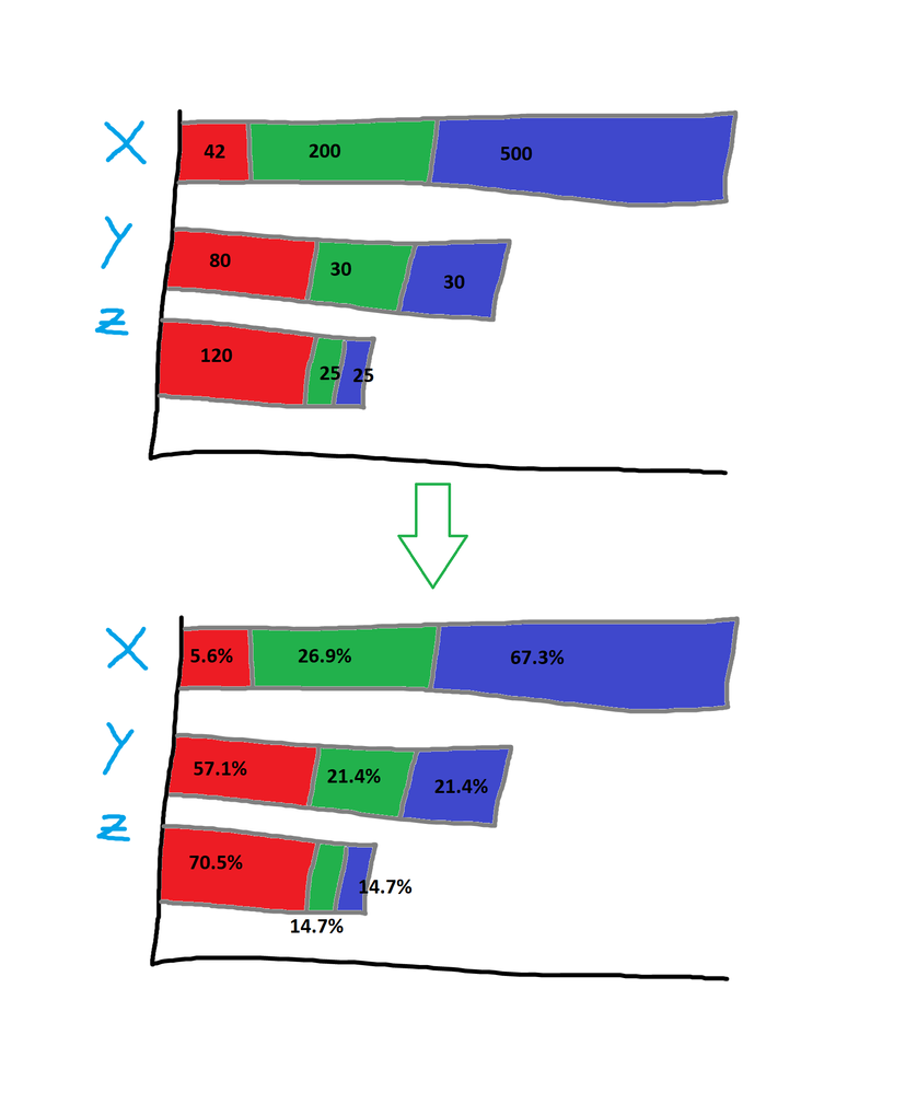
I am trying to get a bar chart with 2 dimensions to show the percentages rather than actual values:
Example:
The bars' length are still sized by a raw value, but we would like to see the percentage breakout respective to each dimension value.
Thoughts?
S
- Mark as New
- Bookmark
- Subscribe
- Mute
- Subscribe to RSS Feed
- Permalink
- Report Inappropriate Content
The measure will be Sum(Value)/Sum(TOTAL <Dim> Value) and format the expression for percentage.
- Mark as New
- Bookmark
- Subscribe
- Mute
- Subscribe to RSS Feed
- Permalink
- Report Inappropriate Content
Hi Skamath1,
For me, doing:
sum(Value)/ sum(Total Value)
results in a bar chart ranging from 0 to 1 with each segment broken by dimension 2.
The percentages of this is what I am looking for, but I still want the bars to vary in length as if it was being plotted by sum(Value)
The reason for this is that we want to see the magnitude of differences between dimension 1 while still understanding per bar, the percentage of each segment contributing to that dimension 1.
- Mark as New
- Bookmark
- Subscribe
- Mute
- Subscribe to RSS Feed
- Permalink
- Report Inappropriate Content
You have to include the <Dim> after the total. Replace the Dim with the name of your first dimension field name. Also change the measure format to use percentage
