Unlock a world of possibilities! Login now and discover the exclusive benefits awaiting you.
- Qlik Community
- :
- Forums
- :
- Analytics & AI
- :
- Products & Topics
- :
- App Development
- :
- Box Plot Grid
- Subscribe to RSS Feed
- Mark Topic as New
- Mark Topic as Read
- Float this Topic for Current User
- Bookmark
- Subscribe
- Mute
- Printer Friendly Page
- Mark as New
- Bookmark
- Subscribe
- Mute
- Subscribe to RSS Feed
- Permalink
- Report Inappropriate Content
Box Plot Grid
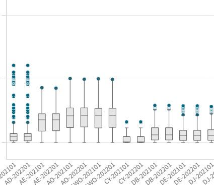
I've built the attached box plot in Qlik sense. However, as you can see the ranges for the various dimensions make most of the box plots unhelpful because they are dwarfed by the larger values. In Tableau and python there are ways to create a grid of charts such that in my case I could put each 2-3 letter X-Axis dimension on its own chart and then parse them there by the year and month (shown after the '-' in the X-Axis). I've not seen anyway in Qlik to generate a grid or multiple charts so I'm not optimistic there is a great answer for this but am going to ask anyways. I do realize I could manually create a separate chart for each 2-3 letter dimension but with over 30 of them that is cumbersome and clunky and just not something I want to do.
