Unlock a world of possibilities! Login now and discover the exclusive benefits awaiting you.
- Qlik Community
- :
- Forums
- :
- Analytics & AI
- :
- Products & Topics
- :
- App Development
- :
- Cartesian chart with count occurencies
- Subscribe to RSS Feed
- Mark Topic as New
- Mark Topic as Read
- Float this Topic for Current User
- Bookmark
- Subscribe
- Mute
- Printer Friendly Page
- Mark as New
- Bookmark
- Subscribe
- Mute
- Subscribe to RSS Feed
- Permalink
- Report Inappropriate Content
Cartesian chart with count occurencies
Hi
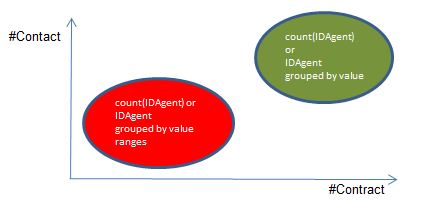
I am looking for the advice of an expert to create a graphic representation, that
from the Data Table table show me the number of Agents who have performed better
(quadrant at the top right) from those who performed worse
(lower left quadrant). Like the attached example chart.
I would prefer not to use the scatter chart cause the high number of agents:
if possible I'd like group them by value ranges.
Thank you
| DataTable | ||
| IDAgent | #Contract | #Contact |
| 1234 | 2 | 10 |
| 1235 | 2 | 10 |
| 1236 | 3 | 10 |
| 1237 | 3 | 12 |
| 1238 | 5 | 12 |
| 1239 | 5 | 14 |
| 1240 | 8 | 14 |
| 1241 | 8 | 16 |
| 1242 | 8 | 18 |
| ....... | ...... | ...... |
Accepted Solutions
- Mark as New
- Bookmark
- Subscribe
- Mute
- Subscribe to RSS Feed
- Permalink
- Report Inappropriate Content
- Mark as New
- Bookmark
- Subscribe
- Mute
- Subscribe to RSS Feed
- Permalink
- Report Inappropriate Content
- Mark as New
- Bookmark
- Subscribe
- Mute
- Subscribe to RSS Feed
- Permalink
- Report Inappropriate Content
Thank you Kush
I thought I would not use the 'scatter chart' due the high number of elements (IDAgent) which makes the map confusing.
I would like to give a summary idea of how many IDAgents are grouped in certain ranges of values, with the possibility of seeing the detail (single IDAgent).
it is not clear to me how the 'valuelist' statement in my case can be applied ( I will study the case of use )
thank you in advance