Unlock a world of possibilities! Login now and discover the exclusive benefits awaiting you.
- Qlik Community
- :
- Forums
- :
- Analytics & AI
- :
- Products & Topics
- :
- App Development
- :
- Chart labels are chopped up
- Subscribe to RSS Feed
- Mark Topic as New
- Mark Topic as Read
- Float this Topic for Current User
- Bookmark
- Subscribe
- Mute
- Printer Friendly Page
- Mark as New
- Bookmark
- Subscribe
- Mute
- Subscribe to RSS Feed
- Permalink
- Report Inappropriate Content
Chart labels are chopped up
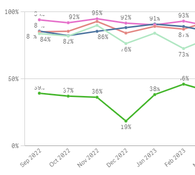
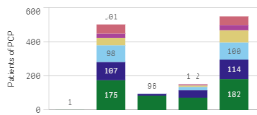
I recently started seeing a problem in bar charts and line charts: the value labels are not visually all there. Two examples:
If I resize the chart or the web browser, I can eventually get it to look good. It doesn't happen with tables, and I haven't noticed it in other visualizations. It happens on other computers and in different web browsers. It doesn't happen outside of Qlik. We're on Sense Enterprise February 2023, client-managed.
Are others having this problem?
Accepted Solutions
- Mark as New
- Bookmark
- Subscribe
- Mute
- Subscribe to RSS Feed
- Permalink
- Report Inappropriate Content
- Mark as New
- Bookmark
- Subscribe
- Mute
- Subscribe to RSS Feed
- Permalink
- Report Inappropriate Content
I'm having the same issue my labels. Did you find anything other than resizing that helped?
- Mark as New
- Bookmark
- Subscribe
- Mute
- Subscribe to RSS Feed
- Permalink
- Report Inappropriate Content
Unfortunately, I haven't found a solution. It's still happening and completely unpredictable. Sorry you have the same problem...
- Mark as New
- Bookmark
- Subscribe
- Mute
- Subscribe to RSS Feed
- Permalink
- Report Inappropriate Content
@Lauri , What kind of Qlik version are you on?
If I look at Qlik cloud as of 25-10-2023 I see the following with labels.
I didn't not change a lot of default settings. the only one I change to make sure all label values are shown is:
apperance > Presentation > show value labels > all
Note that Qlik cloud is constantly being updated by Qlik. if a change is not working the Qlik might revert back to before that change.
Also remember Qlik does a auto-scaling so that most information is show.
therefore sometimes charts randomly cut off labels.
for the first pictue do you have the vertical axis set to 100% manually? if so there might lay part of your problem.
for the bar chart part, Qlik by default (and you cannot change this) will only show value labels if they fit if not then Qlik will not show. This also explains why you say that if you scale up the charts then value labels are shown. (because there is space to put the value labels there)
- Mark as New
- Bookmark
- Subscribe
- Mute
- Subscribe to RSS Feed
- Permalink
- Report Inappropriate Content
Thanks, @MartW - I'm on client-managed, now August 2023 R2. Most of the time the labels are fine, just like yours. The problem is rare enough (and minor enough) that it's not worth reverting to an earlier version.
- Mark as New
- Bookmark
- Subscribe
- Mute
- Subscribe to RSS Feed
- Permalink
- Report Inappropriate Content
@Lauri , from my experience with earlier versions, with regards to the bar-chart, this will also happen on earlier versions of Qlik. It is build in to Qlik.
for the Line-chart part, try and change the vertical axis to 110% or to auto in order to let Qlik decide where to put the labels, and if there is enought space to put multiple labels close to eachother
- Mark as New
- Bookmark
- Subscribe
- Mute
- Subscribe to RSS Feed
- Permalink
- Report Inappropriate Content
Thanks for the suggestion. I changed the Y axis to be much wider, and made the chart full-screen, and it looks like this:
I then resized my browser window (to be smaller), and now it looks good:
I resized the browser to 100%, and it still looks good. So it's completely unpredictable. I can switch sheets to fix it, or resize the chart, or resize the web browser. Anything can fix it, or sometimes nothing fixes it.
- Mark as New
- Bookmark
- Subscribe
- Mute
- Subscribe to RSS Feed
- Permalink
- Report Inappropriate Content
- Mark as New
- Bookmark
- Subscribe
- Mute
- Subscribe to RSS Feed
- Permalink
- Report Inappropriate Content
@mikaelsc - that seems to be the solution. Many thanks! I hope Qlik is able to address the root cause instead of relying on all users to disable hardware acceleration.
- Mark as New
- Bookmark
- Subscribe
- Mute
- Subscribe to RSS Feed
- Permalink
- Report Inappropriate Content
I fixed this issue by turning off grid line spacing, and selecting "no lines". Previously was having the same problem, especially with larger numbers.


