Unlock a world of possibilities! Login now and discover the exclusive benefits awaiting you.

- Qlik Community
- :
- Forums
- :
- Analytics & AI
- :
- Products & Topics
- :
- App Development
- :
- Chart of 15 days evolution for different products
- Subscribe to RSS Feed
- Mark Topic as New
- Mark Topic as Read
- Float this Topic for Current User
- Bookmark
- Subscribe
- Mute
- Printer Friendly Page

 jjmarti
- Mark as New
- Bookmark
- Subscribe
- Mute
- Subscribe to RSS Feed
- Permalink
- Report Inappropriate Content
Chart of 15 days evolution for different products
Hey, I have a list of 20 different products with a different launch day... I want to show in a card the impact during the first 15 days of each product.
| Product | Launch Date | Sales | |
| A | 22-01-2019 | 1000 | |
| B | 22-02-2019 | 1300 | |
| C | 22-03-2019 | 900 |
I just make here like total sales but I have the daily sales data
Thank you!

 Lauri
Lauri
- Mark as New
- Bookmark
- Subscribe
- Mute
- Subscribe to RSS Feed
- Permalink
- Report Inappropriate Content
I would use set analysis. With Product as the Dimension of the table, the Sales measure can be:
=Sum({<SaleDate={"<=$(=LaunchDate+15)"}>} Sales)
jjmarti
- Mark as New
- Bookmark
- Subscribe
- Mute
- Subscribe to RSS Feed
- Permalink
- Report Inappropriate Content
Hi!
Thank you for your help, maybe I was not 100% correct with my question..
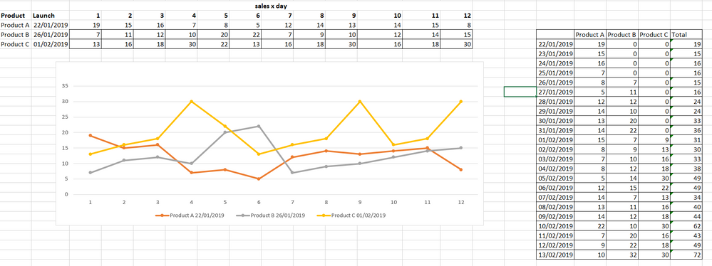
I made an example about what I need exactly, is to check in a chart the first 15 days (even month or other) of each product that means that axis X must contains the number of days, months or others and the axis Y contains the Sum of sales for each of the days, month or other
You can see in the right side table that sales for product B start days later and even the Product C, but in the chart all the product have start at "day 1" till the end.
that means that the visualisation shows you, let me say, how good is your product and can proof a tendency about which product is going to be better with time. In that case looks that PRODUCT C is the best one for a new promotion and Product A had a bad performance and you need to change something
 Lauri
Lauri
- Mark as New
- Bookmark
- Subscribe
- Mute
- Subscribe to RSS Feed
- Permalink
- Report Inappropriate Content
I understand your goal now. Do you need help transforming your data? Or creating the chart?
