Unlock a world of possibilities! Login now and discover the exclusive benefits awaiting you.
- Qlik Community
- :
- Forums
- :
- Analytics & AI
- :
- Products & Topics
- :
- App Development
- :
- Chart with background
- Subscribe to RSS Feed
- Mark Topic as New
- Mark Topic as Read
- Float this Topic for Current User
- Bookmark
- Subscribe
- Mute
- Printer Friendly Page
- Mark as New
- Bookmark
- Subscribe
- Mute
- Subscribe to RSS Feed
- Permalink
- Report Inappropriate Content
Chart with background
Hello together,
I am currently looking for a way to create a line chart with background.
I want to display a ratio (as a percentage) as a line over time.
The background should be divided into three areas: 0-40% red, 40-60% yellow, >60% green.
Unfortunately I can't find any possibilities to display this.
Does anyone of you have a tip?
Thanks and greetings
- Mark as New
- Bookmark
- Subscribe
- Mute
- Subscribe to RSS Feed
- Permalink
- Report Inappropriate Content
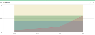
Using a line chart with "Area" selected would come somewhat close to achieving this, though it wouldn't be an exact solution. I didn't set up a color scheme to get the red/yellow/green set up but it is possible, of course.
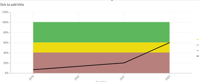
If you use extensions, some of them have more advanced styling options, including the ability to have some measures as areas and some measures as lines. I was able to create this using Vizlib Line Chart, for example:
- Mark as New
- Bookmark
- Subscribe
- Mute
- Subscribe to RSS Feed
- Permalink
- Report Inappropriate Content
Hi,
thanks for the answer.
I was able to recreate the first example, but it looks quite strange when the colors overlap like this.
It looks better with the Vizlib extension, however we can't use it. So it would be better to rebuild this with board means.

