Unlock a world of possibilities! Login now and discover the exclusive benefits awaiting you.
- Qlik Community
- :
- Forums
- :
- Analytics & AI
- :
- Products & Topics
- :
- App Development
- :
- Color by Variable
- Subscribe to RSS Feed
- Mark Topic as New
- Mark Topic as Read
- Float this Topic for Current User
- Bookmark
- Subscribe
- Mute
- Printer Friendly Page
- Mark as New
- Bookmark
- Subscribe
- Mute
- Subscribe to RSS Feed
- Permalink
- Report Inappropriate Content
Color by Variable
Hi
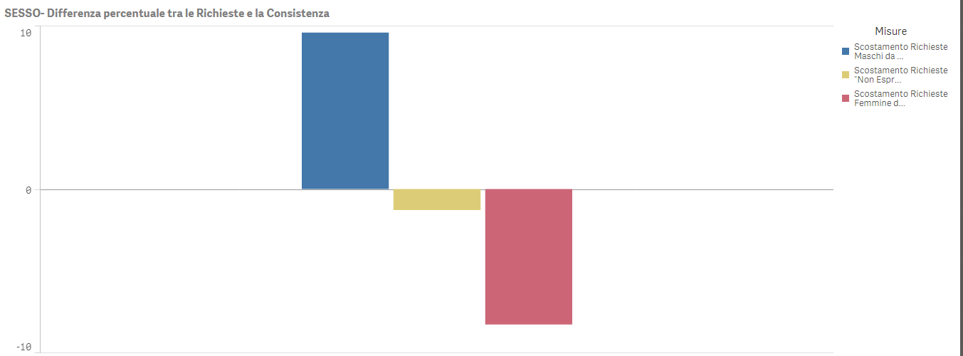
I have a colour problem in a bar chart. The bar chart is composed by 3 different measures that are the result of a difference between specific percentage from 2 different tables (ANAG and LOG).
If I chose "Automatic Colour" or "Multicolour" the 3 different variables will have 3 different colour (like in the picture).
I need that this 3 colours (blue, yellow and rose) arent based on the default colour, but I have to choose it
The variable $(scostamentoRichM) is composed with this expression :
//$(scostamentoRichM):
(sum({<[Sesso]= {'Maschio'}>} rich_totali)  /  (Sum(rich_totali))  *100)   //this percentage is from table LOG
-
(sum({<[Usp_a_SESSO]= {'M'}>} Usp_a_NUM)  //this percentage is from table ANAG
     /
     (sum({<[Usp_a_SESSO]= {'M'}>} Usp_a_NUM)
          +sum({<[Usp_a_SESSO]= {'F'}>} Usp_a_NUM)
               +sum({<[Usp_a_SESSO]= {'ND'}>} Usp_a_NUM)) *100)
The other 2 variables have the same espression but is called $(scostamentoRichF) and $(scostamentoRichND).
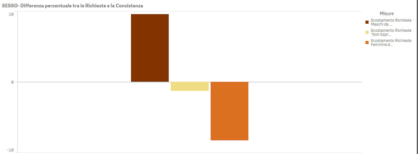
I need the coloration like this (picture below):
$(scostamentoRichM) = rgb(130,51,0)
$(scostamentoRichND) = rgb(240,220,130)
$(scostamentoRichF) = rgb(219,112, 32)
THANKS!!
Accepted Solutions
- Mark as New
- Bookmark
- Subscribe
- Mute
- Subscribe to RSS Feed
- Permalink
- Report Inappropriate Content
Hi
See this post it may help
https://community.qlik.com/message/1074046#1074046
and this one also for bar chart
https://community.qlik.com/docs/DOC-8492
the principe is to
Set your dimension normally
Add second dimension like this
ValueList('mesure1','mesure2','mesure3')
then add mesure
if(ValueList('mesure1','mesure2','mesure3')='mesure1'
,$(scostamentoRichM)
,if(ValueList('mesure1','mesure2','mesure3')='mesure2'
,$(scostamentoRichND)
,$(scostamentoRichF)
)
)
and now set the color like this
if(ValueList('mesure1','mesure2','mesure3')='mesure1'
,rgb(130,51,0)
,if(ValueList('mesure1','mesure2','mesure3')='mesure2'
,rgb(240,220,130)
,rgb(219,112, 32)
)
)
Hope it helps
- Mark as New
- Bookmark
- Subscribe
- Mute
- Subscribe to RSS Feed
- Permalink
- Report Inappropriate Content
Thanks. It Works!!
- Mark as New
- Bookmark
- Subscribe
- Mute
- Subscribe to RSS Feed
- Permalink
- Report Inappropriate Content
glad to hear that 
- Mark as New
- Bookmark
- Subscribe
- Mute
- Subscribe to RSS Feed
- Permalink
- Report Inappropriate Content
As a workaround we can create a combo chart without lines, here we can assign any collor we want