Unlock a world of possibilities! Login now and discover the exclusive benefits awaiting you.
- Qlik Community
- :
- Forums
- :
- Analytics & AI
- :
- Products & Topics
- :
- App Development
- :
- Combining Apps
- Subscribe to RSS Feed
- Mark Topic as New
- Mark Topic as Read
- Float this Topic for Current User
- Bookmark
- Subscribe
- Mute
- Printer Friendly Page
- Mark as New
- Bookmark
- Subscribe
- Mute
- Subscribe to RSS Feed
- Permalink
- Report Inappropriate Content
Combining Apps
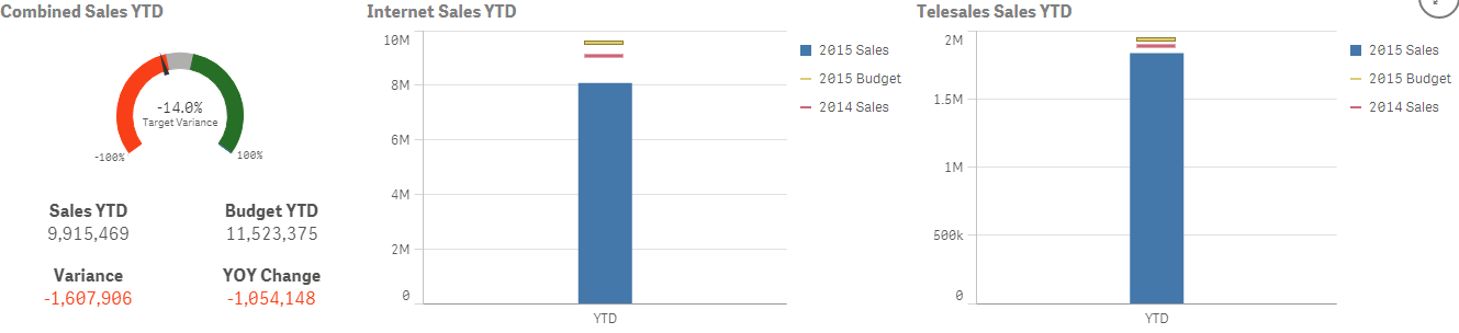
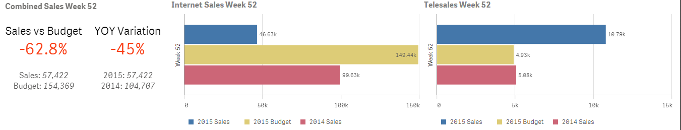
Hi i have just started using qliksense to create a weekly executive report showing sales performance for the last week, an average of the last 4 weeks and year to date. i am having an issue combining graphs of ytd sales and an average of last 4 weeks sales. OR combinng last weeks sales with YTD sales.
The data in my excel file that i uploaded is like this:
| Wk | Total 2015 Sales | Total 2015 Budget | Total 2015 Budget Absolute Variance | Total 2015 Budget % Variance |
| 50 | 76,80 | 70,00 | 64,80 | 9.8% |
| 51 | 82,32 | 89,24 | -6,82 | -7.7% |
| 52 | 57,42 | 154,69 | -96,97 | -62.8% |
| YTD | 9,15,469 | 11,53,375 | -1,60,906 | -14.0% |
The only that i have found to show only week 52 sales in my combined chart is to use a week filter and then select '52'. This is fine but i have a another combined chart trying to show 'YTD' but the data here will show week 52 data because of the filter i selected. To show YTD data i have to select the YTD filter but then i will have both 52 and YTD in both graphs.
ive attached images of the 2 graphs. i had to create the graphs in different apps to get them to appear. i wasn't even able to create them in separate sheets because of the week filter apparently applies to all sheets within an app.
Any solution to this please?