Unlock a world of possibilities! Login now and discover the exclusive benefits awaiting you.

- Qlik Community
- :
- Forums
- :
- Analytics & AI
- :
- Products & Topics
- :
- App Development
- :
- Create a Calculated Pareto Dimension for a Pie Cha...
- Subscribe to RSS Feed
- Mark Topic as New
- Mark Topic as Read
- Float this Topic for Current User
- Bookmark
- Subscribe
- Mute
- Printer Friendly Page

 mrthomasshelby
- Mark as New
- Bookmark
- Subscribe
- Mute
- Subscribe to RSS Feed
- Permalink
- Report Inappropriate Content
Create a Calculated Pareto Dimension for a Pie Chart
Hello all! I have a dataset that is as follows:
Vendor Sales Type
A 1300 C
B 2200 N
A 1400 N
B 2100 N
C 2500 C
A 300 N
C 900 C
D 3200 N
B 2000 C
D 1500 C
E 1100 N
F 3500 C
E 1500 C
G 1400 N
H 600 C
H 900 N
G 1200 C
Now I would like to create a Calculated dimension to use in a Pie chart. The Pie chart should have the Dimensions as 'C' and 'N Top 80%'. To further break it down, I'd like to show the % of Sales coming under the Type C and % of Sales coming under the Top 80%(Pareto) Vendors in Type N. Can you please help me create a calculated dimension to achieve this? TIA!
- « Previous Replies
-
- 1
- 2
- Next Replies »
Accepted Solutions

 sunny_talwar
- Mark as New
- Bookmark
- Subscribe
- Mute
- Subscribe to RSS Feed
- Permalink
- Report Inappropriate Content
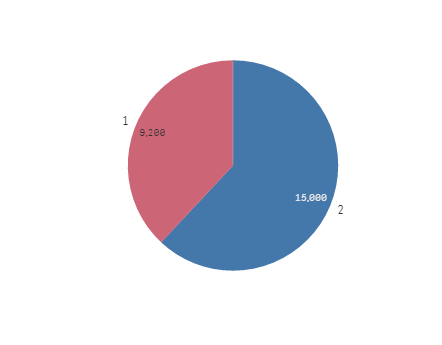
Something like this?
Dimension
=ValueList(1, 2)
Expression
Pick(ValueList(1, 2),
Sum(Aggr(If(Rangesum(Above(Sum({<Vendor, Type = {'N'}>} Sales)/Sum({<Vendor, Type = {'N'}>} TOTAL Sales),0,RowNo()))<=0.8, Sum({<Type = {'N'}>}Sales)), (Vendor,(=Sum({<Vendor, Type = {'N'}>} Sales),Desc)))),
Sum({<Type = {'C'}>}Sales))
sunny_talwar
- Mark as New
- Bookmark
- Subscribe
- Mute
- Subscribe to RSS Feed
- Permalink
- Report Inappropriate Content
Can you put down the result you expect to see from this data in a tabular form for us to understand your requirement?
mrthomasshelby
- Mark as New
- Bookmark
- Subscribe
- Mute
- Subscribe to RSS Feed
- Permalink
- Report Inappropriate Content
Sure. Now what I'd like for the Pie chart to have is two partitions: Sales under Type 'C' and Sales coming from Top 80% Vendors in Type N. If we perform a Pareto analysis on the above dataset within Type N, we can see that the Vendors 'A','B' and 'D' fall into the Top 80% category. So the result should display as follows: 9200 Under Top 80% Type N
Vendor Split: A:1700(1400+300),
B:4300(2100+2200),
D:3200) and
15000 under Type C:
(Vendor Split:A:1300,
B:2000,
C:3400(2500+900),
D:1500,
E:1500,
F:3500,
G:1200,
H:600).
sunny_talwar
- Mark as New
- Bookmark
- Subscribe
- Mute
- Subscribe to RSS Feed
- Permalink
- Report Inappropriate Content
Something like this?
Dimension
=ValueList(1, 2)
Expression
Pick(ValueList(1, 2),
Sum(Aggr(If(Rangesum(Above(Sum({<Vendor, Type = {'N'}>} Sales)/Sum({<Vendor, Type = {'N'}>} TOTAL Sales),0,RowNo()))<=0.8, Sum({<Type = {'N'}>}Sales)), (Vendor,(=Sum({<Vendor, Type = {'N'}>} Sales),Desc)))),
Sum({<Type = {'C'}>}Sales))
mrthomasshelby
- Mark as New
- Bookmark
- Subscribe
- Mute
- Subscribe to RSS Feed
- Permalink
- Report Inappropriate Content
As usual you are correct! Could you please explain a little bit about the expression and the ValueList function or give the relevant links? Much much appreciated! Thanks a lot!
sunny_talwar
- Mark as New
- Bookmark
- Subscribe
- Mute
- Subscribe to RSS Feed
- Permalink
- Report Inappropriate Content
Valuelist is a synthetic dimension. I can go over its explanation, but some of the other guys have already done the great work. Check these links out
ValueList() – For those tricky situations
mrthomasshelby
- Mark as New
- Bookmark
- Subscribe
- Mute
- Subscribe to RSS Feed
- Permalink
- Report Inappropriate Content
Sorry for the trouble but let's say there's another field for the data as follows:
Vendor Sales Type Type1
A 1300 C M
B 2200 N S
A 1400 N M
B 2100 N M
C 2500 C S
A 300 N M
C 900 C M
D 3200 N M
B 2000 C S
D 1500 C S
E 1100 N S
F 3500 C M
E 1500 C M
G 1400 N S
H 600 C M
H 900 N S
G 1200 C M
Now I'd like to display the same pie chart above for the Sales of in Bottom 20% Pareto of Type1='M'. How should I modify the above expression?
sunny_talwar
- Mark as New
- Bookmark
- Subscribe
- Mute
- Subscribe to RSS Feed
- Permalink
- Report Inappropriate Content
How can you have two fields with Type1 header?
mrthomasshelby
- Mark as New
- Bookmark
- Subscribe
- Mute
- Subscribe to RSS Feed
- Permalink
- Report Inappropriate Content
My bad! I've made the correction.Thanks!
sunny_talwar
- Mark as New
- Bookmark
- Subscribe
- Mute
- Subscribe to RSS Feed
- Permalink
- Report Inappropriate Content
So this would be the third pie?

- « Previous Replies
-
- 1
- 2
- Next Replies »