Unlock a world of possibilities! Login now and discover the exclusive benefits awaiting you.
- Qlik Community
- :
- Forums
- :
- Analytics & AI
- :
- Products & Topics
- :
- App Development
- :
- Re: Cumulative Line Graph - QlikSense
- Subscribe to RSS Feed
- Mark Topic as New
- Mark Topic as Read
- Float this Topic for Current User
- Bookmark
- Subscribe
- Mute
- Printer Friendly Page
- Mark as New
- Bookmark
- Subscribe
- Mute
- Subscribe to RSS Feed
- Permalink
- Report Inappropriate Content
Cumulative Line Graph - QlikSense
Good Afternoon,
I am looking for an expression to create a cumulative line graph based on the following data example.
Month Total Savings
Jan-2017 100000
Feb-2017 25000
March-2017 12500
April-2017 10000
In this example, I would want the line point to be 100000 for Jan, 125000 for Feb, 137500 for March and 147500 for April.
Thinking this might be simple, but i am having trouble accomplishing it.
Accepted Solutions
- Mark as New
- Bookmark
- Subscribe
- Mute
- Subscribe to RSS Feed
- Permalink
- Report Inappropriate Content
Hi Andrew,
add your Month values as dimension and for the measure use:
aggr(rangesum( above( sum([Total Savings]),0,rowno())),Month)
after appropriate sorting your line chart will look like below. I think below is what you want.
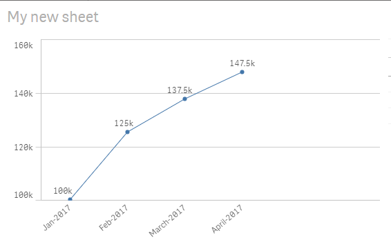
regards,
O.Y
- Mark as New
- Bookmark
- Subscribe
- Mute
- Subscribe to RSS Feed
- Permalink
- Report Inappropriate Content
rangesum( above( sum([Expression1]),0,rowno()))
- Mark as New
- Bookmark
- Subscribe
- Mute
- Subscribe to RSS Feed
- Permalink
- Report Inappropriate Content
Hi Andrew,
add your Month values as dimension and for the measure use:
aggr(rangesum( above( sum([Total Savings]),0,rowno())),Month)
after appropriate sorting your line chart will look like below. I think below is what you want.
regards,
O.Y
- Mark as New
- Bookmark
- Subscribe
- Mute
- Subscribe to RSS Feed
- Permalink
- Report Inappropriate Content
Hi and sorry for posting in this conversation but I believe you can help me out. I had the same issue and the solution you have provided helped me out. However, I still have an issue with the x-axis. My case is that the y-axis is the revenue while the x-axis is the number of nights (I am running a hotel). So lets say, I have a total revenue of 30000 and a total nights of 500 (so average revenue per night is 60), then I want to create a linear graph were the values would be shown as follows:
Nights Revenue
50 -> 3000
100 -> 6000
......
leading to 500 Nights and 30000. I have managed to aggregate the revenue using the expressions you have already posted, however, I am having an issue with the aggregation of the duration. Also note that I have a variable of duration, which calculates the duration of every single reservation added in the spreadsheet.
Thanks a lot
- Mark as New
- Bookmark
- Subscribe
- Mute
- Subscribe to RSS Feed
- Permalink
- Report Inappropriate Content
How would the expression look like, if you were to start counting from the beginning by each beginning of the month, i.e. display only the recent month + add up daily sales until month ends and start over again?
Thank you!