Unlock a world of possibilities! Login now and discover the exclusive benefits awaiting you.
- Qlik Community
- :
- Forums
- :
- Analytics & AI
- :
- Products & Topics
- :
- App Development
- :
- Re: Custom color by expression for two different e...
- Subscribe to RSS Feed
- Mark Topic as New
- Mark Topic as Read
- Float this Topic for Current User
- Bookmark
- Subscribe
- Mute
- Printer Friendly Page
- Mark as New
- Bookmark
- Subscribe
- Mute
- Subscribe to RSS Feed
- Permalink
- Report Inappropriate Content
Custom color by expression for two different expressions
I have a stacked bar-chart, with one dimension and two expressions.
Both expressions have a different meaning, but should be stacked to indicate a total.
By choosing color "Auto" or "Custom - Multicolored" I get the following visualization:
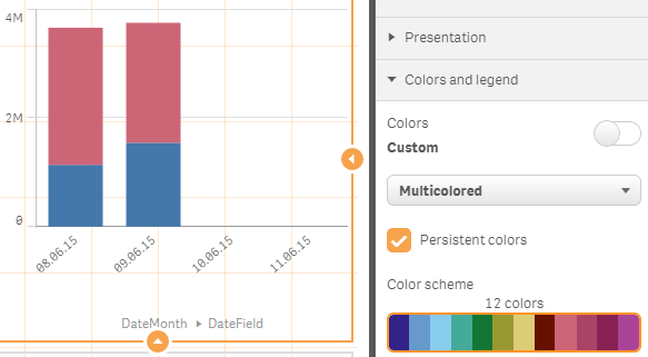
Almost perfect... Just not these default colors blue and purple-red-ish.
In the rest of my dashboard I use two custom colors for the meaning of these expressions, which I want to apply to this bar-chart.
Choosing color "Custom - By expression" allows me to create an expression to color. But I cannot seem to make a color-expression that results in a different color for the first and second expression. The single color-expressions seems to be applied on both expressions equally and I don't know if (and how) I can actually make an "IF"-statement to address them separately...
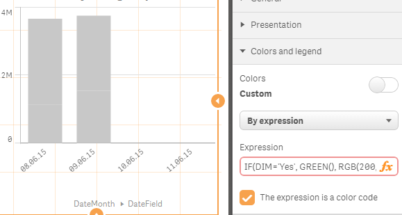
One of the attempts include an IF statement that checks for a dimension-value particular for one of the expressions.
Another attempt includes checking COLUMN(1), also didn't get that to work.
How can I use the custom color expression to set different colors for expressions?
- « Previous Replies
-
- 1
- 2
- Next Replies »
- Mark as New
- Bookmark
- Subscribe
- Mute
- Subscribe to RSS Feed
- Permalink
- Report Inappropriate Content
Thanks for pointing to that other thread. Helpful!
Although it achieves the result, it's far from ideal when trying to use a consistent color for a certain country throughout the dashboard.
- Mark as New
- Bookmark
- Subscribe
- Mute
- Subscribe to RSS Feed
- Permalink
- Report Inappropriate Content
Gysbert,
What solution would you suggest for Combo Chart (not a Bar Chart) case?
As far as I know CC are not allowing multiple dimensions (I am using QS 2.1.1)....
Regards,
Vladimir
- Mark as New
- Bookmark
- Subscribe
- Mute
- Subscribe to RSS Feed
- Permalink
- Report Inappropriate Content
Can you explain what you want to do in a combo chart with regard to colors? Preferably in a new discussion.
talk is cheap, supply exceeds demand
- Mark as New
- Bookmark
- Subscribe
- Mute
- Subscribe to RSS Feed
- Permalink
- Report Inappropriate Content
I need to set different (non-standard or "suggested" by Qlik) colors for my measures...
I have 4: 2 Bars and 2 lines.
I've created a post trying to understand if I can use the same approach as above in Combo charts.. (Unable to add second dimension to a Combo chart)
Regards,
VK
- Mark as New
- Bookmark
- Subscribe
- Mute
- Subscribe to RSS Feed
- Permalink
- Report Inappropriate Content
One way to achieve this is by creating a Master Item Measure for both of your measures. In creation of this measure you are able to select the color of your choice for each respective measure and these colors will stay consistent throughout your app if you have them displayed in multiple sheets.
- Mark as New
- Bookmark
- Subscribe
- Mute
- Subscribe to RSS Feed
- Permalink
- Report Inappropriate Content
Hi,
This helped me a lot to achieve colour by expression but how can I set the colour according to a comparison between the 2 bars?
I have Actual vs Budget so my expression is
pick(match(only({<FISCAL_MONTH={"<=$(vMaxMonth)"}>}[ACTUAL/BUDGET]), 'Actual','Budget'),sum({<CODE_LVL8={'HBVERK'},FISCAL_MONTH={"<=$(vMaxMonth)"}>}ACTUAL*-1),
sum({<CODE_LVL8={'HBVERK'},FISCAL_MONTH={"<=$(vMaxMonth)"}>}BUDGET*-1))
I want the Actual bar to be LightRed() when it is less than budget?
- Mark as New
- Bookmark
- Subscribe
- Mute
- Subscribe to RSS Feed
- Permalink
- Report Inappropriate Content
Why is this so darn complex in Qlik? 😤
Like c'mon, selecting by measure does not work straightforward. Selecting multi-color does not allow self selecting a color scheme. And doing by expression is far from straightforward too.
It should not be this complex.
- « Previous Replies
-
- 1
- 2
- Next Replies »