Unlock a world of possibilities! Login now and discover the exclusive benefits awaiting you.
- Qlik Community
- :
- Forums
- :
- Analytics & AI
- :
- Products & Topics
- :
- App Development
- :
- Distribution plot on a range of dates - How to sho...
- Subscribe to RSS Feed
- Mark Topic as New
- Mark Topic as Read
- Float this Topic for Current User
- Bookmark
- Subscribe
- Mute
- Printer Friendly Page
- Mark as New
- Bookmark
- Subscribe
- Mute
- Subscribe to RSS Feed
- Permalink
- Report Inappropriate Content
Distribution plot on a range of dates - How to show the most recent date?
Hi,
I have been experimenting with the distribution plot to show the range of inventory values across different dates. At the same time, I would like to use specific color on the most recent data point.
I use the following expression to mark the current months' data with red color:
IF($(vInvDate)='$(=Max($(vInvDate)))',RGB(214, 0, 28))
When there is less data (=Rolling 3 months), it will show up nicely (well, most of the time)
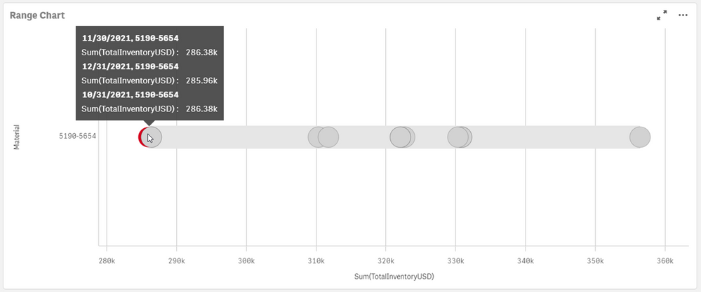
However, when there are more data points (=Rolling 12 months), the current month's data point is "blocked" by others.
Is there any way to show the current month's data point on top of other data points with similar value?
Thanks in advance.
Accepted Solutions
- Mark as New
- Bookmark
- Subscribe
- Mute
- Subscribe to RSS Feed
- Permalink
- Report Inappropriate Content
Hello,
There is not any property, in the Distribution plot chart, that can control which points appear on the top and which appear on the bottom. In that use case scenario, you will have to submit a feature request [1]. However, there are some workarounds that you can use to distinguish the values that you need.
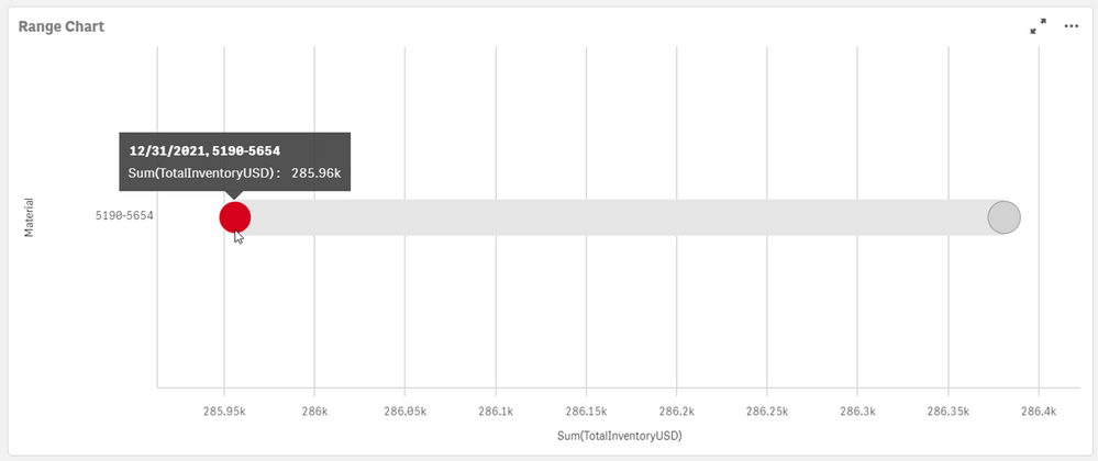
This is the visualization that I have:

Workaround 1:
In the official documentation "Distribution plot properties" [2], it is stated that you can use Jitter points property, which is exactly designed for the purpose of distinguishing overlapping points.
Workaround 2:
If you go under Appearance > Presentation and you change the Bubble size property, you can make the points much smaller so they will not overlap as much as when they are much bigger.
Workaround 3:
You can add a reference line under Add-ons > Reference lines to allow the user focus on the particular value that you want. However, in that use case scenario the color of the point is still not very clear.
I hope that this information was helpful. In case I have misunderstood the use case scenario, please elaborate in details by providing additional information. However, if it has helped you resolve the issue, please mark it as accepted solution to give further visibility to other community members.
---
- Mark as New
- Bookmark
- Subscribe
- Mute
- Subscribe to RSS Feed
- Permalink
- Report Inappropriate Content
Hello,
There is not any property, in the Distribution plot chart, that can control which points appear on the top and which appear on the bottom. In that use case scenario, you will have to submit a feature request [1]. However, there are some workarounds that you can use to distinguish the values that you need.
This is the visualization that I have:

Workaround 1:
In the official documentation "Distribution plot properties" [2], it is stated that you can use Jitter points property, which is exactly designed for the purpose of distinguishing overlapping points.
Workaround 2:
If you go under Appearance > Presentation and you change the Bubble size property, you can make the points much smaller so they will not overlap as much as when they are much bigger.
Workaround 3:
You can add a reference line under Add-ons > Reference lines to allow the user focus on the particular value that you want. However, in that use case scenario the color of the point is still not very clear.
I hope that this information was helpful. In case I have misunderstood the use case scenario, please elaborate in details by providing additional information. However, if it has helped you resolve the issue, please mark it as accepted solution to give further visibility to other community members.
---
- Mark as New
- Bookmark
- Subscribe
- Mute
- Subscribe to RSS Feed
- Permalink
- Report Inappropriate Content
Hi Andrei,
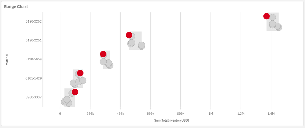
The workaround #1 works for me. It shows as follow
Appreciate your fast response. Have a good day.


