Unlock a world of possibilities! Login now and discover the exclusive benefits awaiting you.
Announcements
Now accepting applications for the Qlik Luminary and Partner Ambassador Programs: Apply by July 6!
- Qlik Community
- :
- Forums
- :
- Analytics & AI
- :
- Products & Topics
- :
- App Development
- :
- Doubt Advanced Analytics Toolbox // R & Qlik Sens...
Options
- Subscribe to RSS Feed
- Mark Topic as New
- Mark Topic as Read
- Float this Topic for Current User
- Bookmark
- Subscribe
- Mute
- Printer Friendly Page
Turn on suggestions
Auto-suggest helps you quickly narrow down your search results by suggesting possible matches as you type.
Showing results for
Contributor II
2021-11-15
02:32 AM
- Mark as New
- Bookmark
- Subscribe
- Mute
- Subscribe to RSS Feed
- Permalink
- Report Inappropriate Content
Doubt Advanced Analytics Toolbox // R & Qlik Sense
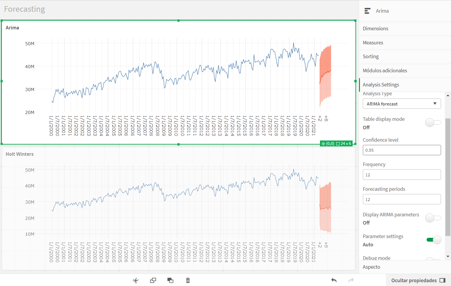
I've been working on integrating R into Qlik for a long time and using the Advanced Analytics Toolbox visualization extension. I am using it essentially for forecasting but currently I have come across a case where I cannot find an explanation for the prediction provided by the extension.
I am going to attach a screenshot below. I do not understand the prediction it makes (clearly underestimated compared to the real data). It seems very strange to me and I don't know why. In what can be seen in the image, no filter has been applied and the real data of the measurement is well loaded (verified). It is a monthly series since 2000. The top chart is Arima (parameter settings in auto option) and the one below is Holt Winters.
I would like to understand the problem and fix it. Thank you very much for your attention.
0 Replies