Unlock a world of possibilities! Login now and discover the exclusive benefits awaiting you.
- Qlik Community
- :
- Forums
- :
- Analytics & AI
- :
- Products & Topics
- :
- App Development
- :
- Dynamic Projected Schedule Line
- Subscribe to RSS Feed
- Mark Topic as New
- Mark Topic as Read
- Float this Topic for Current User
- Bookmark
- Subscribe
- Mute
- Printer Friendly Page
- Mark as New
- Bookmark
- Subscribe
- Mute
- Subscribe to RSS Feed
- Permalink
- Report Inappropriate Content
Dynamic Projected Schedule Line
Hello,
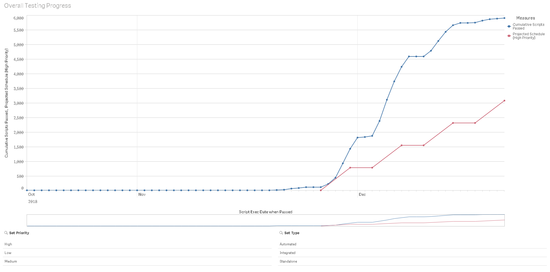
I have the following equation to plot a project schedule line on a chart for the target number of test scripts passed each week over a 4 week testing period. The line is flat over the weekends as no weekend work is projected to happen.
IF([Script Exec Date when Passed]='11/26/2018', '0', (IF([Script Exec Date when Passed]='11/30/2018',
'767', (IF([Script Exec Date when Passed]='12/3/2018', '767', (IF([Script Exec Date when Passed]='12/7/2018',
'1534', (IF([Script Exec Date when Passed]='12/10/2018', '1534', (IF([Script Exec Date when Passed]='12/14/2018', '2301',
(IF([Script Exec Date when Passed]='12/17/2018', '2301', (IF([Script Exec Date when Passed]='12/21/2018', '3068', '')))))))))))))))
I have input the numbers manually for High Priority Scripts, but I actually want the projected line to change dynamically when I filter on either Script Priority (Low, Medium, High) or Script Type (Integrated, Standalone, Automated). I have attached a picture of the graph with the projected red line, and actual blue line. The blue line is dynamic with the filters and I would like the red line to respond the same way.