Unlock a world of possibilities! Login now and discover the exclusive benefits awaiting you.
- Qlik Community
- :
- Forums
- :
- Analytics & AI
- :
- Products & Topics
- :
- App Development
- :
- Dynamic changing of x axis of bar chart with filte...
- Subscribe to RSS Feed
- Mark Topic as New
- Mark Topic as Read
- Float this Topic for Current User
- Bookmark
- Subscribe
- Mute
- Printer Friendly Page
- Mark as New
- Bookmark
- Subscribe
- Mute
- Subscribe to RSS Feed
- Permalink
- Report Inappropriate Content
Dynamic changing of x axis of bar chart with filter selection in qliksense
Hi All, i want to show a bar chart in which measure is for eg count(y) in Y axis,but the x -axis should change and should show whatever values we are selecting from filterpanes
.For eg- i have 10 filterpanes 1-10
On selecting say 5values from filterpane1, the x axis in the chart should show 5 bars with respect to count(y) i.e measure
On selecting ,say 3values from filterpane2, the x axis in the chart should show 2 bars and so on.
- Mark as New
- Bookmark
- Subscribe
- Mute
- Subscribe to RSS Feed
- Permalink
- Report Inappropriate Content
Hi,
First you have to create a variable which is used for aggregate like
vCapacitySelection=if(getselectedcount(Account_l5)=0 or getselectedcount(Account_l5)>1,'Account_l5',
if(getselectedcount(Account_l5)=1 and getselectedcount(SUGGESTED_VENDOR_NAME)=0,'SUGGESTED_VENDOR_NAME',if(getselectedcount(SUGGESTED_VENDOR_NAME)>=1, 'SUGGESTED_VENDOR_NAME')))
in Y-Axis , choose Custom range (Min/Max)
Min=0
Max=
=Max(Aggr(
Count(Field),$(vCapacitySelection)))
with the help of above variable, first Max value of Y axis is based on L5, then by vendor name
Like that you can add more field and conditions
- Mark as New
- Bookmark
- Subscribe
- Mute
- Subscribe to RSS Feed
- Permalink
- Report Inappropriate Content
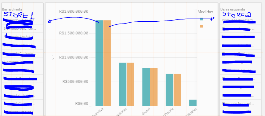
You must create an alternate state that will represent each bar in your chart.
For example: I want to select two different stores to compare the sale of each one, so:
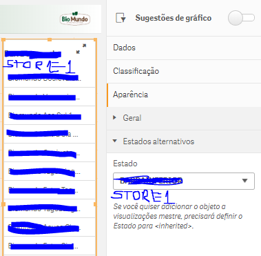
I create 3 alternative states in the master items.
Store1
store2

After:
Within the graph for each measure you will place an expression for each bar of the graph that will represent the selected stores.

= Sum ({Store1} [Total Amount Items])

= Sum ({store2} [Total Amount Items])
--------------

For each filter panel you will place an alternate inherited state (Store1) or (Store2)


- Mark as New
- Bookmark
- Subscribe
- Mute
- Subscribe to RSS Feed
- Permalink
- Report Inappropriate Content
Thanks for the suggestion..
actually my requirement is to make everything dynamic i.e not hardcoding even the field names...it has to be through variables or getfunctions that we have. But how to approach for that this i i unaware of.