Unlock a world of possibilities! Login now and discover the exclusive benefits awaiting you.
- Qlik Community
- :
- Forums
- :
- Analytics & AI
- :
- Products & Topics
- :
- App Development
- :
- Formatting
- Subscribe to RSS Feed
- Mark Topic as New
- Mark Topic as Read
- Float this Topic for Current User
- Bookmark
- Subscribe
- Mute
- Printer Friendly Page
- Mark as New
- Bookmark
- Subscribe
- Mute
- Subscribe to RSS Feed
- Permalink
- Report Inappropriate Content
Formatting
In a Qliksense Combo chart, Is it possible to switch on the data points for one measure and switch off for the other? As of now, we only have the option to Switch on or off for all measures.
Also, is it possible to colour the fonts(datapoints) with conditional formatting?
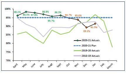
The screenshot below is a sample chart of what we are looking for. If you see the line trend for 2020-21 Actuals, the data points are coloured based on the comparison with 2020-21 Plan. If we are above the plan, then mark the data points in Green, if we are 20% below then Amber, else Red.
We have to hide the datapoints for the other three expressions in the chart. Ex., 2020-21 Actuals should show data points and hide them for 2020-21 Plan, 2019-20 Actuals & 2018-19 Actuals. We don’t have this option in QS at the moment.
- Mark as New
- Bookmark
- Subscribe
- Mute
- Subscribe to RSS Feed
- Permalink
- Report Inappropriate Content
Can someone please help me on how to achieve this?
