Unlock a world of possibilities! Login now and discover the exclusive benefits awaiting you.
- Qlik Community
- :
- Forums
- :
- Analytics
- :
- App Development
- :
- Re: Funnel Chart help.
- Subscribe to RSS Feed
- Mark Topic as New
- Mark Topic as Read
- Float this Topic for Current User
- Bookmark
- Subscribe
- Mute
- Printer Friendly Page
- Mark as New
- Bookmark
- Subscribe
- Mute
- Subscribe to RSS Feed
- Permalink
- Report Inappropriate Content
Funnel Chart help.
Hi Friends, my requirement is to create a funnel chart using Bar chart in qliksense. I followed this thread
need help in making a Bar chart that looks like funnel
but somehow it's not working. I used all three expressions but doesn't work. I don't have a license, so am not able to view the qvw file.
if anybody has qvf. please share.
3 Expressions which I am Using :
(1-(Sum(Value)/Max(Total AGGR(Sum(Value),Category))))*.5
Dual(Num(sum(Value),'#.##0,0;-#,##,0,0'),Category)
(1-(Sum(Value)/Max(Total AGGR(Sum(Value),Category))))*.5
Any help is highly appreciated.
- Mark as New
- Bookmark
- Subscribe
- Mute
- Subscribe to RSS Feed
- Permalink
- Report Inappropriate Content
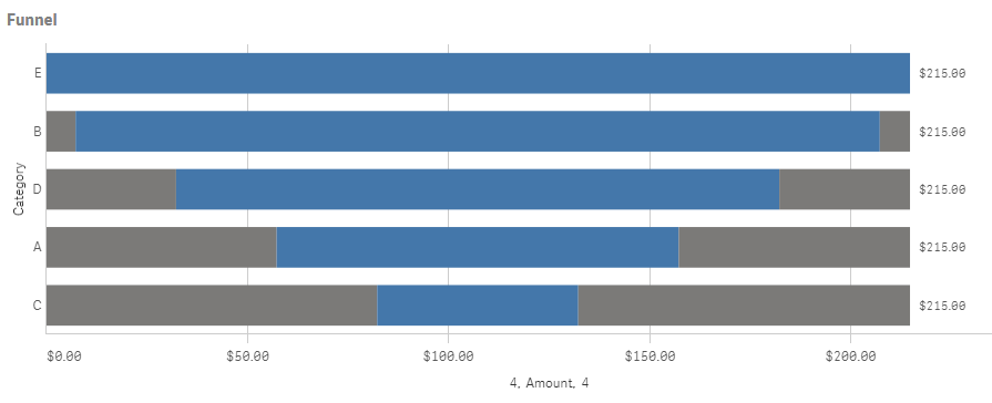
Hi Archana,
I have managed to make the chart like a funnel, but I can't get the labelling to do what I want. See my chart below.
Here are my settings:
Expression 1 and 3: (Max(TOTAL Aggr(sum(Value), Category))-Sum(Value))/2
Expression 2: Sum(Value)
I have created a Master item for 1 and 3 and colored it Gray
- Mark as New
- Bookmark
- Subscribe
- Mute
- Subscribe to RSS Feed
- Permalink
- Report Inappropriate Content
Hi Lisa I used same expression as your's but I get one sided chart . how are you sorting your chart? Do we need to set something in sorting or in Range -> Appearance ?

- Mark as New
- Bookmark
- Subscribe
- Mute
- Subscribe to RSS Feed
- Permalink
- Report Inappropriate Content
Check that it is Stacked under Appearance, Presentation