Unlock a world of possibilities! Login now and discover the exclusive benefits awaiting you.
- Qlik Community
- :
- Forums
- :
- Analytics & AI
- :
- Products & Topics
- :
- App Development
- :
- Re: Heatmap Pivot Table
- Subscribe to RSS Feed
- Mark Topic as New
- Mark Topic as Read
- Float this Topic for Current User
- Bookmark
- Subscribe
- Mute
- Printer Friendly Page
- Mark as New
- Bookmark
- Subscribe
- Mute
- Subscribe to RSS Feed
- Permalink
- Report Inappropriate Content
Heatmap Pivot Table
Hello,
Does anyone have a good solution to represent a heatmap in QlikSense?
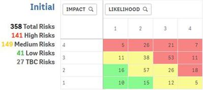
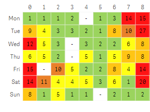
Following the advice here (https://community.qlik.com/t5/New-to-QlikView/Working-with-a-Risk-Map/td-p/1112151) I have created some heatmaps using a pivot table. The result is nice, the only issue is that when filters are applied, rows without values disappear, destroying the square shape.
Is there any way to maintain the rows/form?
before filtering:
after filtering:
Thank you for any suggestions!
Carly
Accepted Solutions
- Mark as New
- Bookmark
- Subscribe
- Mute
- Subscribe to RSS Feed
- Permalink
- Report Inappropriate Content
Hello,
I was able to find a simple solution without requesting the extension (as it is a difficult business process for me).
Measure:
Count ({1} Aggr ( Count ( CaseID ), Impact, Likelihood)) * Count(CaseID)
Thank you!
Carly
- Mark as New
- Bookmark
- Subscribe
- Mute
- Subscribe to RSS Feed
- Permalink
- Report Inappropriate Content
Dear Carly,
I think, that we have something, which is helpful. LeapLytics provides advanved extensions for project reporting in QlikSense. You can find more on: www.leaplytics.de or you can try our free extensions in Qlik Garden Branch:
https://developer.qlik.com/garden/5fd6531adae7960011eb30ec
https://developer.qlik.com/garden/5fa315a3495c3700115f38b5
I am happy to hear from you and if you have any questions, just send me a message or mail (bjoern.lange@leaplytics.de)
Regards,
Bjoern
- Mark as New
- Bookmark
- Subscribe
- Mute
- Subscribe to RSS Feed
- Permalink
- Report Inappropriate Content
Hi @CarlyPharma ,
I use the extension 2DimHeatmap (https://github.com/ralfbecher/QlikSense_Extension_2DimHeatmap) and to keep the rectangular format of it without cells disappearing I configure the measure as this:
if(Count(itemID)+0*count({1}itemID)>0,
Count(itemID)+0*count({1}itemID))
This means that if the count of the measure is greater than zero, the heatmap displays the count on the cell. If it's zero, a null (a dash) gets displayed.
I hope this helps.
- Mark as New
- Bookmark
- Subscribe
- Mute
- Subscribe to RSS Feed
- Permalink
- Report Inappropriate Content
Hello,
I was able to find a simple solution without requesting the extension (as it is a difficult business process for me).
Measure:
Count ({1} Aggr ( Count ( CaseID ), Impact, Likelihood)) * Count(CaseID)
Thank you!
Carly


