Unlock a world of possibilities! Login now and discover the exclusive benefits awaiting you.
- Qlik Community
- :
- Forums
- :
- Analytics & AI
- :
- Products & Topics
- :
- App Development
- :
- Re: *Help* Scaling a normal distribution plot to t...
- Subscribe to RSS Feed
- Mark Topic as New
- Mark Topic as Read
- Float this Topic for Current User
- Bookmark
- Subscribe
- Mute
- Printer Friendly Page
- Mark as New
- Bookmark
- Subscribe
- Mute
- Subscribe to RSS Feed
- Permalink
- Report Inappropriate Content
*Help* Scaling a normal distribution plot to the bar chart maximum
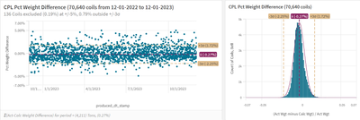
I am trying to scale a normal distribution plot to the maximum value of the bar chart. I have charts like these for multiple manufacturing units and have used variable to allow the user to filter what to exclude (e.g. +/-10 % error, +/- 5% error, etc) and for how many months to review.
The below image is what I have so far. It is achieved by using the NormDist function and multiplying it by a constant and the total count of coils. I would like to scale it so the height of the Bell curve is exactly equal to the maximum bar.
In excel I would just multiply it by the ratio of the highest bar divided by the largest value of the bell curve. I'm not quite sure how to do that in Qlik. This is what I'm currently using to get the Bell curve above
=Only(NormDist(Round(WgtDiffPct,.001)
, $(vCPLMeanPct)
, $(vCPLSigmaPct)
,0)
*.0012*(Count(total{$<facility_cd={'P'},report_production_date={">=$(=MonthStart(Max(Today()),$(=(v_Months_To_Use))))<=$(=MonthEnd(Max(Today())))"},
WgtDiffPct={">=-$(=(v_FilterPct))<=$(=(v_FilterPct))"}>} coil_no)))
I thought about using something like Max(Aggr(Count{...},Round(WgtDiffPct,.001))), but Qlik didn't like that. I'm guessing that is because it sees Round(WgtDiffPct,.001) as a calculated dimension.
Any suggestions on how to do this?
Thanks a bunch!
Accepted Solutions
- Mark as New
- Bookmark
- Subscribe
- Mute
- Subscribe to RSS Feed
- Permalink
- Report Inappropriate Content
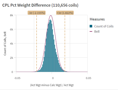
I took another stab at this a few moments ago and got it to work. This was the solution to scale the bell curve to the highest individual bar on the raw data:

- Mark as New
- Bookmark
- Subscribe
- Mute
- Subscribe to RSS Feed
- Permalink
- Report Inappropriate Content
Anyone have any suggestions??
Thanks.
- Mark as New
- Bookmark
- Subscribe
- Mute
- Subscribe to RSS Feed
- Permalink
- Report Inappropriate Content
You may try as Bell-Expression a synchronizing-approach with something like:
rangemin(Bell-Expression, CountCoils-Expression)
- Mark as New
- Bookmark
- Subscribe
- Mute
- Subscribe to RSS Feed
- Permalink
- Report Inappropriate Content
Thanks Marcus. I actually figured out how to do it this morning after I bumped the thread. I'll post the solution in a moment.
- Mark as New
- Bookmark
- Subscribe
- Mute
- Subscribe to RSS Feed
- Permalink
- Report Inappropriate Content
I took another stab at this a few moments ago and got it to work. This was the solution to scale the bell curve to the highest individual bar on the raw data:

