Unlock a world of possibilities! Login now and discover the exclusive benefits awaiting you.
- Qlik Community
- :
- Forums
- :
- Analytics
- :
- App Development
- :
- Help with graph
- Subscribe to RSS Feed
- Mark Topic as New
- Mark Topic as Read
- Float this Topic for Current User
- Bookmark
- Subscribe
- Mute
- Printer Friendly Page
- Mark as New
- Bookmark
- Subscribe
- Mute
- Subscribe to RSS Feed
- Permalink
- Report Inappropriate Content
Help with graph
Hi everyone,
I need some help with a graph.
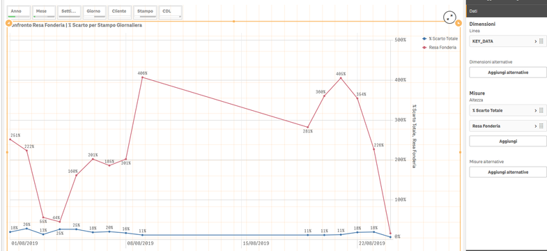
As you can see I have 2 lines of values but I need to group them for multiple "categories" (in this app are named "Stampo", it is a dimension I created formatting a field of the DB).
So, I need to see all the numbers you see here (3808, 3818, etc..) in the legend, and for every code, the values that are now shown in the graph.
I'm not able to find a way to do this and I don't see a graph that can help me.
I hope you understand,
Thank you.
- Mark as New
- Bookmark
- Subscribe
- Mute
- Subscribe to RSS Feed
- Permalink
- Report Inappropriate Content
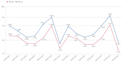
What i understood is that you need to use two dimensions, one for categories in axis 'y' and the other one for your dates in your axis 'x'
Something like this
As you can see i have two dimensions, one for 'Region' and the other one for dates, if that's the case here is the option:
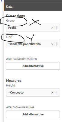
There you have the option to add group (axis x) and line (axis y)
The option to add a dimension on axis 'y' disappears when you have more than one measure, thats why in your image you only have one option.
I hope this helps!
- Mark as New
- Bookmark
- Subscribe
- Mute
- Subscribe to RSS Feed
- Permalink
- Report Inappropriate Content
Hi,
first of all, thank for your help.
I've tried what you wrote and it's almost correct.
Unfortunately, what I need are 2 dimensions and 2 Measures (that are percentages)...


