Unlock a world of possibilities! Login now and discover the exclusive benefits awaiting you.
- Qlik Community
- :
- Forums
- :
- Analytics
- :
- Topics
- :
- App Development
- :
- How to Build a Lorenz Curve in Qlik Sense?
- Subscribe to RSS Feed
- Mark Topic as New
- Mark Topic as Read
- Float this Topic for Current User
- Bookmark
- Subscribe
- Mute
- Printer Friendly Page
- Mark as New
- Bookmark
- Subscribe
- Mute
- Subscribe to RSS Feed
- Permalink
- Report Inappropriate Content
How to Build a Lorenz Curve in Qlik Sense?
Hi,
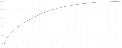
I am trying to build something similar to a Lorenz Curve (https://en.wikipedia.org/wiki/Lorenz_curve) in QlikSense like the chart below.
I currently have a list of Customers and yearly sales (aggregated per customer) like the following:
| Customer | Sales |
| A | 1743 |
| B | 532 |
| C | 1323 |
I would like to display the Customer percentile on the x-axis and their corresponding sales percentile on the y-axis. I'm able to create the above curve by pre-sorting the customers by sales and pre-calculating each customer's percentile rank and the cumulative sales up to each customer in the load script-- however the chart is then obviously not responsive to filters in Qlik. Has anyone had luck creating a Lorenz Curve on the front end that will respond fully to selections?
