Unlock a world of possibilities! Login now and discover the exclusive benefits awaiting you.
- Qlik Community
- :
- Forums
- :
- Analytics & AI
- :
- Products & Topics
- :
- App Development
- :
- How to display trends with big changes
- Subscribe to RSS Feed
- Mark Topic as New
- Mark Topic as Read
- Float this Topic for Current User
- Bookmark
- Subscribe
- Mute
- Printer Friendly Page
- Mark as New
- Bookmark
- Subscribe
- Mute
- Subscribe to RSS Feed
- Permalink
- Report Inappropriate Content
How to display trends with big changes
Hi, I have a set of data with customer, product purchased on weekly basis and quantity.
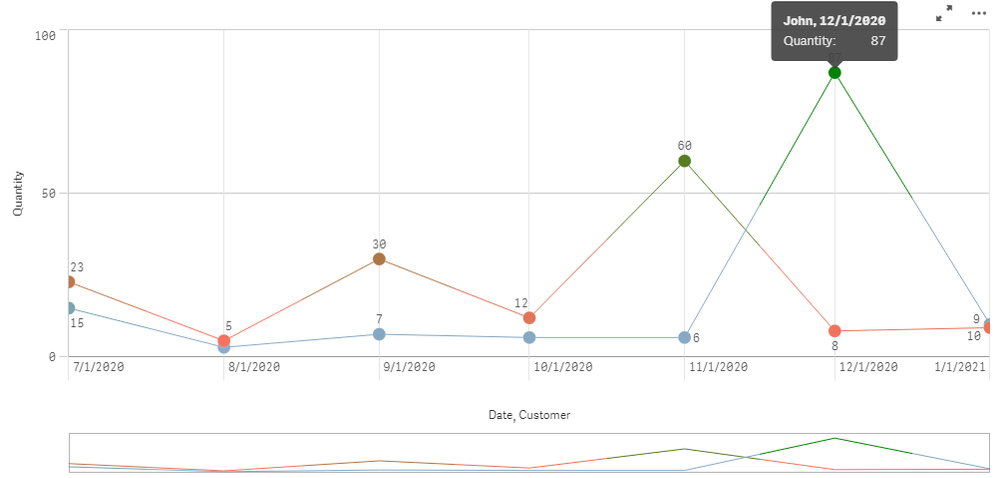
in the data, there are about 1000 customers. I only want to display the customers where there's a 30% drop or 30% jump in the quantity of orders for the most recent week. view the example below
| customer | product | quantity |
| John | se22 | 6 |
| John | se23 | 9 |
| John | se22 | 3 |
| John | se22 | 7 |
| John | se22 | 6 |
| John | se22 | 6 |
| John | se22 | 87 |
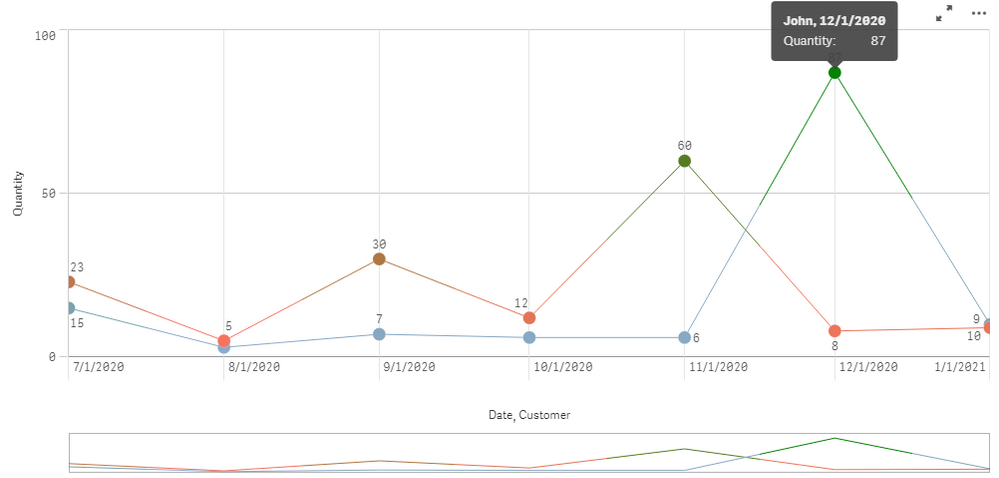
As you can see john has been very consistent with his purchases except his latest purchase was huge compared to his previous purchase. this is the type of customer i want to view in form of a line chart displaying the trend.
Most customers are always consistent with heir order quantity, but in case there is a 30% drop or a jump, we want to display that on a line chart showing the trend
- Mark as New
- Bookmark
- Subscribe
- Mute
- Subscribe to RSS Feed
- Permalink
- Report Inappropriate Content
http://dataonthe.rocks/outliers-in-qlik-sense/
hope this helps!
Thanks,
Priyanka
- Mark as New
- Bookmark
- Subscribe
- Mute
- Subscribe to RSS Feed
- Permalink
- Report Inappropriate Content
whenever you want to show some exception .. try to find which property is best fit - Size, Shape ,Color
In Case of Line Chart data point Size and shape is constant for all.. So only option is yo use Color property.
Look into Color() and Colormix1() function in qlik - Docs
For Reference Only :
Color by expression
ColorMix1(
	(sum(quantity) - $(=Min(Aggr(sum(quantity), pdate, customer))))
    / $(=Max(Aggr(sum(quantity), pdate, customer)))
    ,color(FieldIndex('customer',customer)), green()
)
I hope this answers your question.
- Mark as New
- Bookmark
- Subscribe
- Mute
- Subscribe to RSS Feed
- Permalink
- Report Inappropriate Content
Whenever you want to highlight exception data.. ask yourself what is the best property : Size, Shape , Color
In case of line chart Size and Shape is constant for all data points.. So you can use Color property
look into Color properties - doc
Code for Reference Only :
ColorMix1(
	(sum(quantity) - $(=Min(Aggr(sum(quantity), pdate, customer))))
    / $(=Max(Aggr(sum(quantity), pdate, customer)))
    ,color(FieldIndex('customer',customer)), green()
)
I hope this answers your question.
- Mark as New
- Bookmark
- Subscribe
- Mute
- Subscribe to RSS Feed
- Permalink
- Report Inappropriate Content
This is helpful and good to know. But what if I only want to display top 5 customers with the biggest jump or drop?? how would I do something like that?
- Mark as New
- Bookmark
- Subscribe
- Mute
- Subscribe to RSS Feed
- Permalink
- Report Inappropriate Content
hi,
SOD:
Load
AutoNumber(RowNo()) as Order_Sequence,
customer,
product,
"quantity"
FROM [lib://REPORT EXTRACTION SSSS1.xlsx]
(ooxml, embedded labels, table is [custome sales drop]);
TTT:
Load *,
if((((Previous("quantity")/"quantity")* 100)-100) > 30 , 'High_Jump','') as High_PER,
if((((Previous("quantity")/"quantity")* 100)-100) < -30 , 'Low_Jump','') as Low_PER,
((Previous("quantity")/"quantity")* 100)-100 as Percentage
Resident SOD
Order by customer;
further drill down chart
in chart you can use limitation with 10 values with ascending or descending values.
i hope it will help to you.
ksrinivasan
- Mark as New
- Bookmark
- Subscribe
- Mute
- Subscribe to RSS Feed
- Permalink
- Report Inappropriate Content
Thanks for the answer. where exactly would I put this script
- Mark as New
- Bookmark
- Subscribe
- Mute
- Subscribe to RSS Feed
- Permalink
- Report Inappropriate Content
hi,
in load script,
Load *,
((Previous("quantity")/"quantity")* 100)-100 as Percentage
Resident SOD
Order by customer;
in chart you can use
DIM: Customer
Measure: Max(Percentage)
Chart range in y-axis setting Max and Min range.
for >30%order min 30,
for <30%order min -30,
ksrinivasan


