Unlock a world of possibilities! Login now and discover the exclusive benefits awaiting you.
- Qlik Community
- :
- Forums
- :
- Analytics & AI
- :
- Products & Topics
- :
- App Development
- :
- How to represent a line chart with many dimensions...
- Subscribe to RSS Feed
- Mark Topic as New
- Mark Topic as Read
- Float this Topic for Current User
- Bookmark
- Subscribe
- Mute
- Printer Friendly Page
- Mark as New
- Bookmark
- Subscribe
- Mute
- Subscribe to RSS Feed
- Permalink
- Report Inappropriate Content
How to represent a line chart with many dimensions without ending up with a chart that looks like a mess?
Hello,
I need a piece of advice.
I have like 9 dimensions and I want to represent the sum of sales in the course of time.
However, if i represent that on a line chart it ends up looking awful...
any suggestion?
thanks!!
Accepted Solutions
- Mark as New
- Bookmark
- Subscribe
- Mute
- Subscribe to RSS Feed
- Permalink
- Report Inappropriate Content
Yes it is possible.
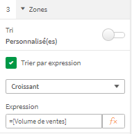
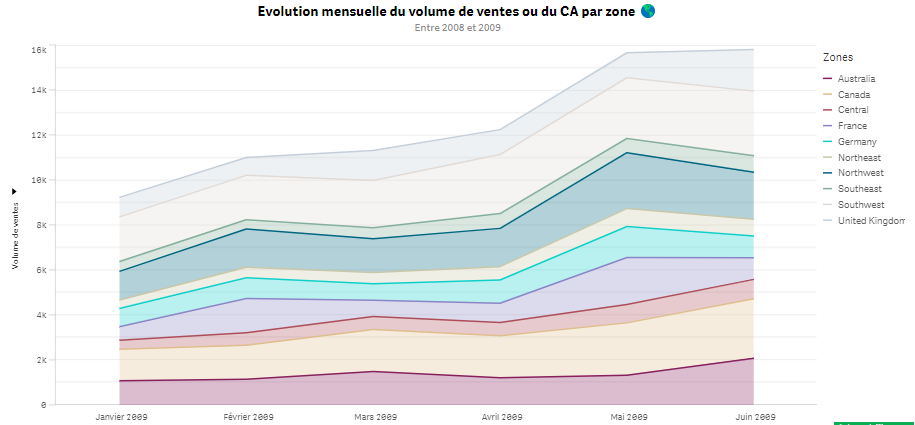
To do this, sorts the measure to ascend the dimension in sort expressions.
Enjoy your Qlik.
Kind regards,
Théo ATRAGIE.
- Mark as New
- Bookmark
- Subscribe
- Mute
- Subscribe to RSS Feed
- Permalink
- Report Inappropriate Content
Hello Nemo ! How are you ?
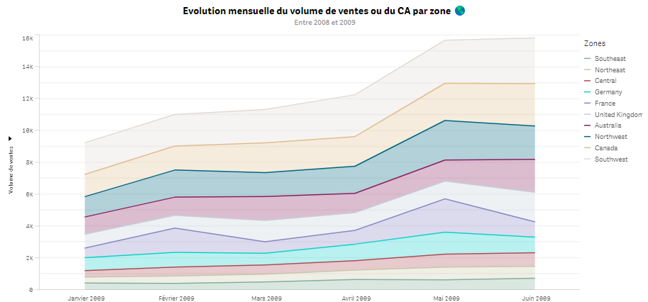
Maybe using the stacked areas?
Enjoy your Qlik.
Kind regards,
Théo ATRAGIE.
- Mark as New
- Bookmark
- Subscribe
- Mute
- Subscribe to RSS Feed
- Permalink
- Report Inappropriate Content
is there a way to sort the dimensions according to their sales in your case? In the case that you are showing me, I would like to have for example Northeast closer to the X axis than Canada, because Canada has more sales... thanks!!
- Mark as New
- Bookmark
- Subscribe
- Mute
- Subscribe to RSS Feed
- Permalink
- Report Inappropriate Content
Yes it is possible.
To do this, sorts the measure to ascend the dimension in sort expressions.
Enjoy your Qlik.
Kind regards,
Théo ATRAGIE.
- Mark as New
- Bookmark
- Subscribe
- Mute
- Subscribe to RSS Feed
- Permalink
- Report Inappropriate Content
I get a message that says "You cannot change sorting when using a continous dimension axis" 😞
- Mark as New
- Bookmark
- Subscribe
- Mute
- Subscribe to RSS Feed
- Permalink
- Report Inappropriate Content
Can you show me ?
- Mark as New
- Bookmark
- Subscribe
- Mute
- Subscribe to RSS Feed
- Permalink
- Report Inappropriate Content
it did work out, merci!
- Mark as New
- Bookmark
- Subscribe
- Mute
- Subscribe to RSS Feed
- Permalink
- Report Inappropriate Content
With pleasure Nemo.


