Unlock a world of possibilities! Login now and discover the exclusive benefits awaiting you.
- Qlik Community
- :
- Forums
- :
- Analytics & AI
- :
- Products & Topics
- :
- App Development
- :
- Line chart - colors by experssion and aggregation
- Subscribe to RSS Feed
- Mark Topic as New
- Mark Topic as Read
- Float this Topic for Current User
- Bookmark
- Subscribe
- Mute
- Printer Friendly Page
- Mark as New
- Bookmark
- Subscribe
- Mute
- Subscribe to RSS Feed
- Permalink
- Report Inappropriate Content
Line chart - colors by experssion and aggregation
Hi gurus,
So I am trying to change the color of a line chart depending on the rank of an indicator in a different expression
So I use the following expression :
if(
aggr(num(rank(aggr(count( {< Group = {"hospitality"},statistic_id -= {"general_feeling"} , value ={">=3"}, status = {"approved"}> } [Feedbacks.%FEEDBACK]),statistic_id),4,1)),statistic_id)=Num(1), rgb(50,203,255),
if(
aggr(num(rank(aggr(count( {< Group = {"hospitality"},statistic_id -= {"general_feeling"} , value ={">=3"}, status = {"approved"}> } [Feedbacks.%FEEDBACK]),statistic_id),4,1)),statistic_id)=Num(2),rgb(0,176,240),
if(
aggr(num(rank(aggr(count( {< Group = {"hospitality"},statistic_id -= {"general_feeling"} , value ={">=3"}, status = {"approved"}> } [Feedbacks.%FEEDBACK]),statistic_id),4,1)),statistic_id)=Num(3),rgb(51,102,153),blue())
)
)
However the problem if I use this expression in the line chart, plotting through time, for each date the rank is re-evaluated.
I am trying to make it consistent through time.
Any ideas ?
(I couldn't find any related issue, but please let me know if this is a duplicate)
Thanks in advance for your help.
- Mark as New
- Bookmark
- Subscribe
- Mute
- Subscribe to RSS Feed
- Permalink
- Report Inappropriate Content
Would you be able to share a sample to look at this issue?
- Mark as New
- Bookmark
- Subscribe
- Mute
- Subscribe to RSS Feed
- Permalink
- Report Inappropriate Content
Hi stalwar1
Thank you for your answer, of course an example is better see in attachment.
The best way is for you to use the bookmark "Problem"
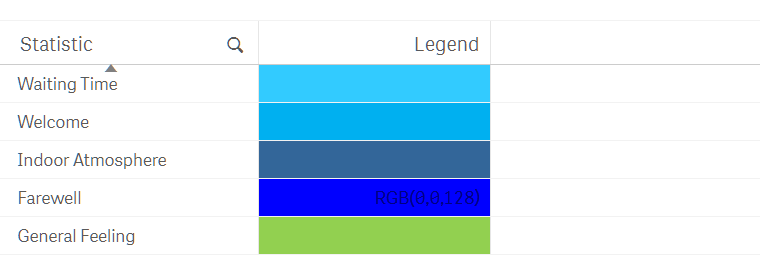
As you can there the color I expect for each line should match this :
How ever the graph color don't match :
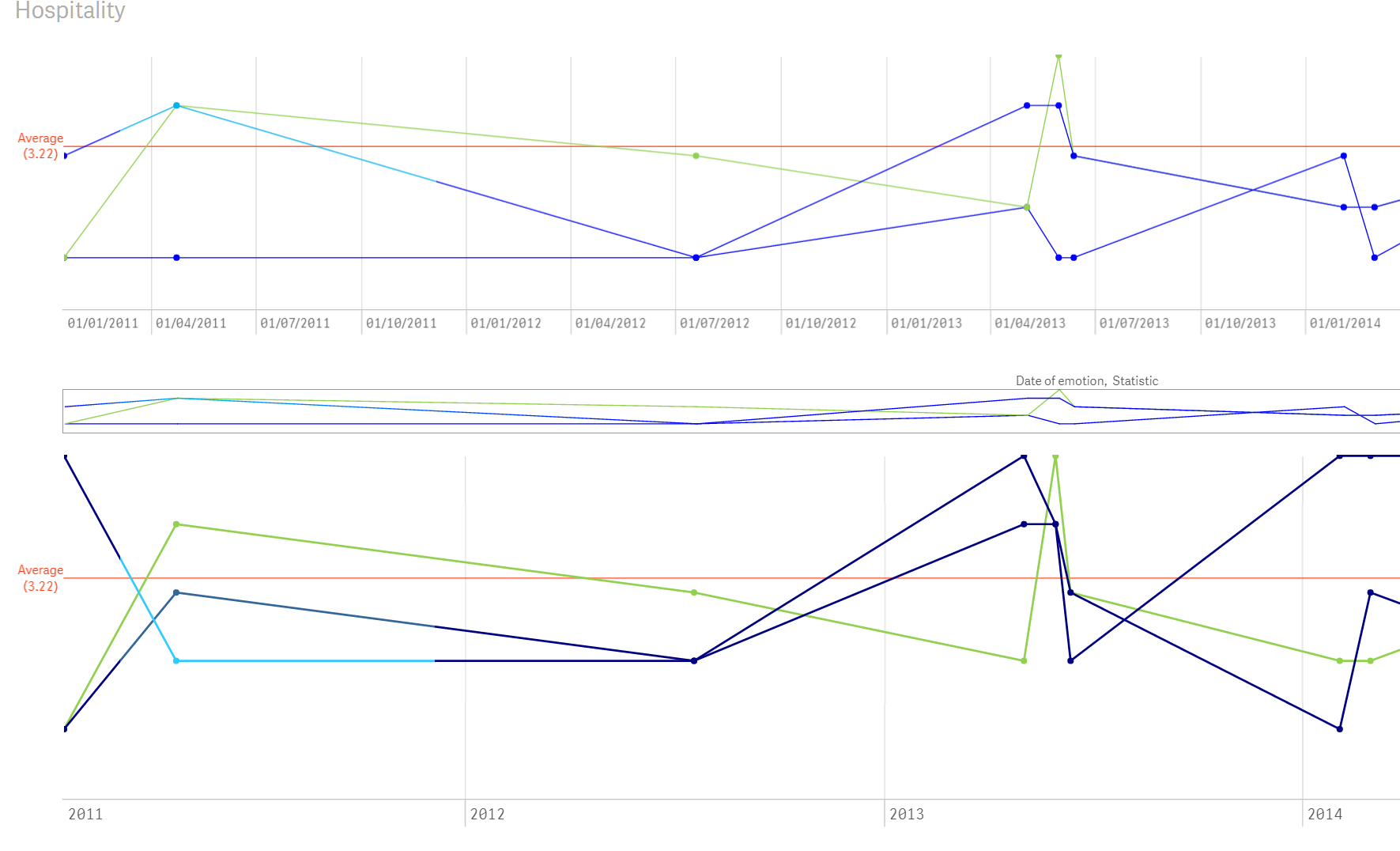
So I can see that the problem come from the fact that we introduced the date in the line chart (I reproduced the same problem in a table), I have been using the aggr function to solve this without any success. If you have any idea about how to solve it let me know.
- Mark as New
- Bookmark
- Subscribe
- Mute
- Subscribe to RSS Feed
- Permalink
- Report Inappropriate Content
Any chance anyone have an answer on this ?