Unlock a world of possibilities! Login now and discover the exclusive benefits awaiting you.
- Qlik Community
- :
- Forums
- :
- Analytics & AI
- :
- Products & Topics
- :
- App Development
- :
- Re: Line chart does not show correct data from piv...
- Subscribe to RSS Feed
- Mark Topic as New
- Mark Topic as Read
- Float this Topic for Current User
- Bookmark
- Subscribe
- Mute
- Printer Friendly Page
- Mark as New
- Bookmark
- Subscribe
- Mute
- Subscribe to RSS Feed
- Permalink
- Report Inappropriate Content
Line chart does not show correct data from pivot table - RangeSum() and Above()
Hi,
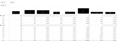
I have the next pivot table:
where the column number 8 is calculated as column7/column3
This columns (3 and 7) are the sum of the above per year
The function is:
(RangeSum(Above((Count (Legajo) * 9 - Fridays),0,12)))/(RangeSum(Above(((count(distinct(leg_numero)) - count(distinct(if([leg_fecegr.autoCalendar.Date]<[Fecha.autoCalendar.Date],leg_numero))) - count(distinct(if([leg_fecing.autoCalendar.Date]>[Fecha.autoCalendar.Date],leg_numero)))) * (Days_w*9 - Fridays)),0,12)))
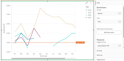
This is working well, the problem is when I want to represent the column number 8 as a line chart:
The values that are shown here are not the same that i have in the pivot table and i dont understand why.
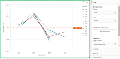
Later, i found out that if i group by year and use the months as the line, the values are the expected, but i want to see them as is shown in the picture above.
Here is the line graph group by year and using month as line:
I think it may be because of the rangesum or the above, but im not sure.
Is there any reason why the values are not showing correctly in the first option? Because the funcion is the same!
Thank you!!
Caro
- Mark as New
- Bookmark
- Subscribe
- Mute
- Subscribe to RSS Feed
- Permalink
- Report Inappropriate Content
I still haven't found the solution.


