Unlock a world of possibilities! Login now and discover the exclusive benefits awaiting you.
- Qlik Community
- :
- Forums
- :
- Analytics & AI
- :
- Products & Topics
- :
- App Development
- :
- Misinterpreting stacked bar labels
- Subscribe to RSS Feed
- Mark Topic as New
- Mark Topic as Read
- Float this Topic for Current User
- Bookmark
- Subscribe
- Mute
- Printer Friendly Page
- Mark as New
- Bookmark
- Subscribe
- Mute
- Subscribe to RSS Feed
- Permalink
- Report Inappropriate Content
Misinterpreting stacked bar labels
Hello fam!
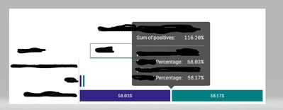
I am trying to develop a stacked bar graph with every similar category that has two types of stacks one above the other
Example: Sales % in the USA in 2019 above Sales % in the USA in 2020
where my category is the USA and two individual segments being sales % in 2019, sales % in 2020.
As we see the sales % is completely individual for each year.
Able to achieve this successfully but the problem is when you hover over the USA it is showing the combined label value for both years like 'Sum of positives - 116%' - which is totally misleading the user.
Is there any way to disable this 'combined label'?
Alternate visualization suggestions are appreciated too.
Thanks for your help in advance!
Sai.
