Unlock a world of possibilities! Login now and discover the exclusive benefits awaiting you.

- Qlik Community
- :
- Forums
- :
- Analytics & AI
- :
- Products & Topics
- :
- App Development
- :
- Qlik Sense ppt chart is not same as source , it is...
- Subscribe to RSS Feed
- Mark Topic as New
- Mark Topic as Read
- Float this Topic for Current User
- Bookmark
- Subscribe
- Mute
- Printer Friendly Page

 paulyeo11
- Mark as New
- Bookmark
- Subscribe
- Mute
- Subscribe to RSS Feed
- Permalink
- Report Inappropriate Content
Qlik Sense ppt chart is not same as source , it is a bug ?
Hi All
This is the chart i create at qlik sense , notice the red dot fall between 0% to 50%.
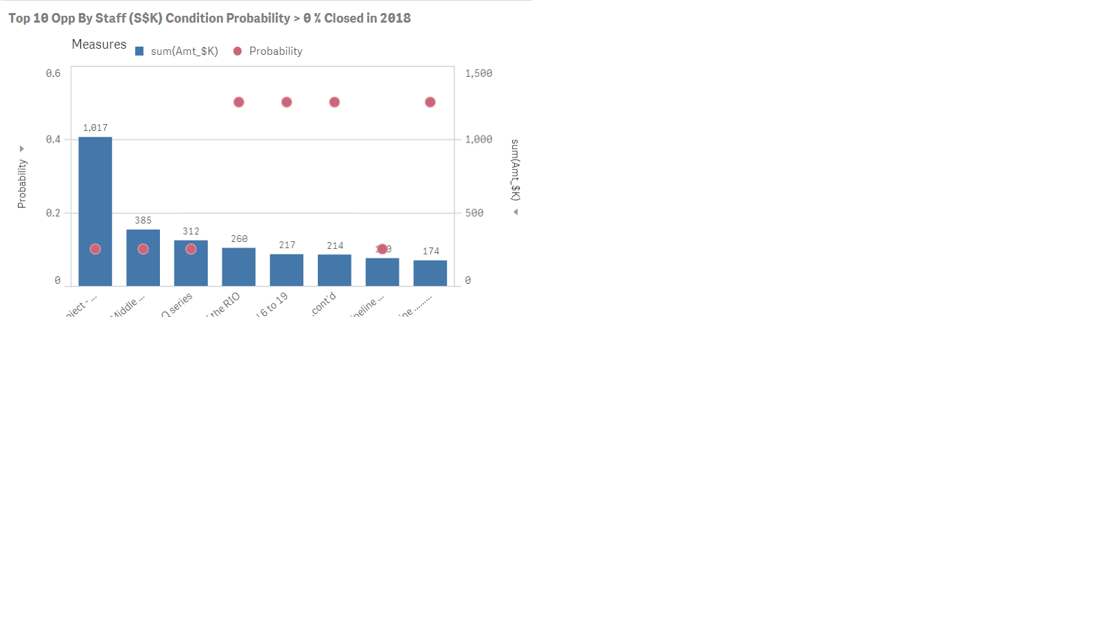
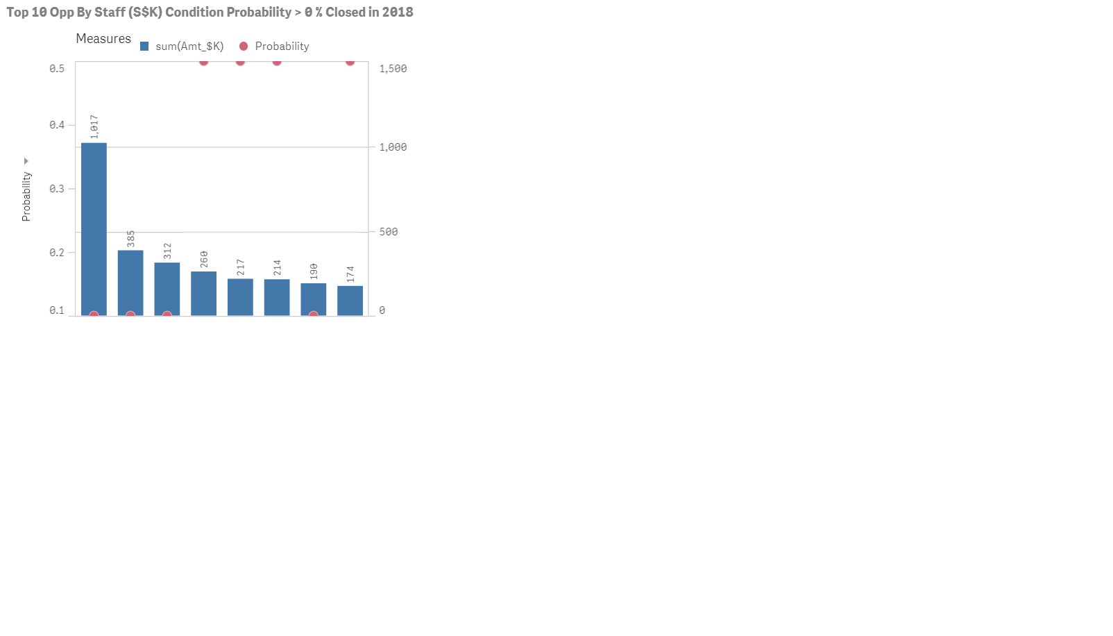
Notice that when it export to ppt report , the Red Dot go missing. it is bug ?
 ErikWetterberg
- Mark as New
- Bookmark
- Subscribe
- Mute
- Subscribe to RSS Feed
- Permalink
- Report Inappropriate Content
Hi!
Is this an extension or the built-in combo chart? If it is the built-in chart you should report it. If it's an extension you need to trobuleshoot it (or ask the extension developer to). This might be a paint method promise that resolves too early for example.
Hope this helps
Erik Wetterberg
paulyeo11
- Mark as New
- Bookmark
- Subscribe
- Mute
- Subscribe to RSS Feed
- Permalink
- Report Inappropriate Content
Hi Erik
I am using the build in chart from Qlik Sense.
May i know it there any way i can check to confirm it cause by what ?
Paul
ErikWetterberg
- Mark as New
- Bookmark
- Subscribe
- Mute
- Subscribe to RSS Feed
- Permalink
- Report Inappropriate Content
What version are you on? Might be it's already fixed in a patch.
Erik Wetterberg
paulyeo11
- Mark as New
- Bookmark
- Subscribe
- Mute
- Subscribe to RSS Feed
- Permalink
- Report Inappropriate Content
I am using 2018 Feb ver
Paul Yeo
DIrector
TDS Technology (S) P/L
Whatsapp +65 9326 1804
www.tdstech.com<http://www.tdstech.com>
ErikWetterberg
- Mark as New
- Bookmark
- Subscribe
- Mute
- Subscribe to RSS Feed
- Permalink
- Report Inappropriate Content
In that case you should absolutetly report it. With some luck it will be fixed in the next patch.
Erik Wetterberg
