Unlock a world of possibilities! Login now and discover the exclusive benefits awaiting you.
- Qlik Community
- :
- Forums
- :
- Analytics & AI
- :
- Products & Topics
- :
- App Development
- :
- Re: Red sections on charts coloured via expression...
- Subscribe to RSS Feed
- Mark Topic as New
- Mark Topic as Read
- Float this Topic for Current User
- Bookmark
- Subscribe
- Mute
- Printer Friendly Page
- Mark as New
- Bookmark
- Subscribe
- Mute
- Subscribe to RSS Feed
- Permalink
- Report Inappropriate Content
Red sections on charts coloured via expression?
I can't find anything relating to this, other than people not realising null content gets rendered grey.
I double checked the item count for the chart, to ensure it's not a limitation of the data being brought in, it's below 10k.
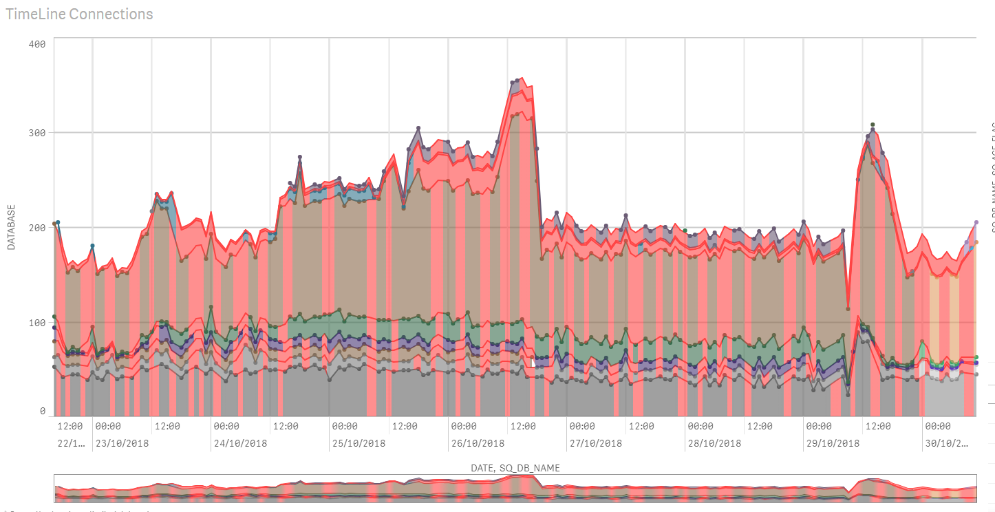
Anyone else experienced this issue? I'm basically charting on two dimensions , where the colour is rendered as an average of the colours by dimension. For some reason, where there are gaps, they're rendering bright red, making the chart unreadable.
They disappear when you zoom into a day.
Should I round up the data points from hourly or am/pm maybe, or to the nearest half-hour?
The date/time is based of a standard timestamp format ( 'YYYY-MM-DD HH:MM:SS.000' ) if that helps.
and here it is zoomed :
As a final thought, it DOES colour correctly when NOT stacked. The error only comes when 'Stacked' is applied.
Accepted Solutions
- Mark as New
- Bookmark
- Subscribe
- Mute
- Subscribe to RSS Feed
- Permalink
- Report Inappropriate Content
It appears the issue is related to overlapping / absent data points on the chart.
Best explained with an image.
I have three dates recorded for the 'Master' dimension ( Grey ) and only Two for the Other dimension ( Brown )
Where the chart is being stacked, and no data-point exists for that stacking point, Qliksense doesn't perform interpolation on the colour measure, and instead paints the gap as Red.
The solution for this ( unless the latest version comes out with interpolation for the colours by expressions? ) - is to normalise your data for these kind of charts upon load.
This would mean filling any gaps in data ( like the one featured below ) so the Qliksense chart doesn't have to interpret/interpolate it.

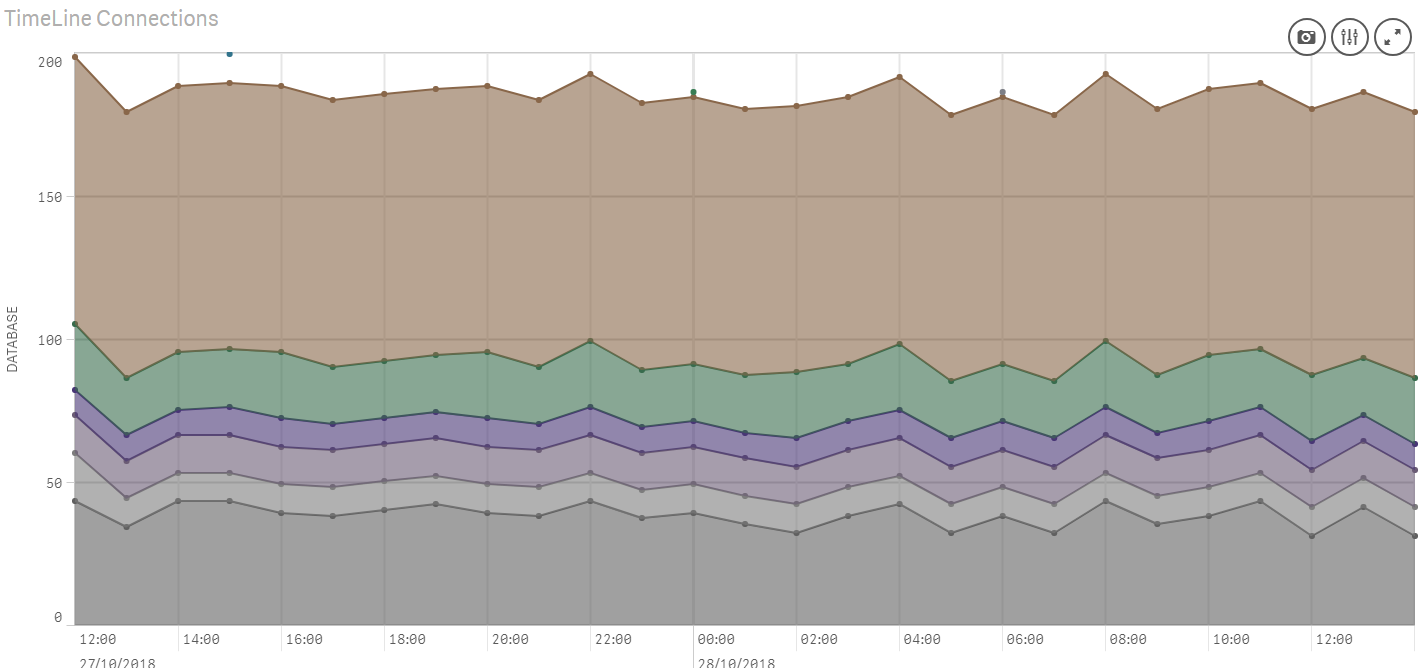
Where all data points exist for a particular range, the issue is not manifest.

- Mark as New
- Bookmark
- Subscribe
- Mute
- Subscribe to RSS Feed
- Permalink
- Report Inappropriate Content
Could you post sample app?
- Mark as New
- Bookmark
- Subscribe
- Mute
- Subscribe to RSS Feed
- Permalink
- Report Inappropriate Content
Have attached a QVF
- Mark as New
- Bookmark
- Subscribe
- Mute
- Subscribe to RSS Feed
- Permalink
- Report Inappropriate Content
You have to have red, blue & green color in your chart?
You expression for color coding is different to your actual expression..
what colors you'd like to see in those lines?
Ex: it should be red if less than 0 and green for greater than 0?
You can simply do color by dimension and use DB_NAME as dimension or Reported time
- Mark as New
- Bookmark
- Subscribe
- Mute
- Subscribe to RSS Feed
- Permalink
- Report Inappropriate Content
It's colouring by Database name and the 'latest/historical' flag dimensions.
RGB
(
AVG(IF(SQ_AGE_FLAG='LATEST',1,0.5) *0.75*DB_R)+50,
AVG(IF(SQ_AGE_FLAG='LATEST',1,0.5) *0.75*DB_G)+50,
AVG(IF(SQ_AGE_FLAG='LATEST',1,0.5) *0.75*DB_B)+50
)
The chart darkens the colour for the 'historical;' age bracket.
I just don't understand why it'd turn red, other than QlikSense applying the shade to flag an error with the data?
- Mark as New
- Bookmark
- Subscribe
- Mute
- Subscribe to RSS Feed
- Permalink
- Report Inappropriate Content
Usually we type in rgb(128,128,18) or red() for color coding with combination of if conditions
here you are giving RGB (Red, Green Blue) maybe thats why it is returning red.
Try to use Red(), green() or blue() or use numbers?
- Mark as New
- Bookmark
- Subscribe
- Mute
- Subscribe to RSS Feed
- Permalink
- Report Inappropriate Content
They're variables creating a conditional average , and you can see it working for 80% of the graph.
- Mark as New
- Bookmark
- Subscribe
- Mute
- Subscribe to RSS Feed
- Permalink
- Report Inappropriate Content
It appears the issue is related to overlapping / absent data points on the chart.
Best explained with an image.
I have three dates recorded for the 'Master' dimension ( Grey ) and only Two for the Other dimension ( Brown )
Where the chart is being stacked, and no data-point exists for that stacking point, Qliksense doesn't perform interpolation on the colour measure, and instead paints the gap as Red.
The solution for this ( unless the latest version comes out with interpolation for the colours by expressions? ) - is to normalise your data for these kind of charts upon load.
This would mean filling any gaps in data ( like the one featured below ) so the Qliksense chart doesn't have to interpret/interpolate it.
Where all data points exist for a particular range, the issue is not manifest.