Unlock a world of possibilities! Login now and discover the exclusive benefits awaiting you.
- Qlik Community
- :
- Forums
- :
- Analytics & AI
- :
- Products & Topics
- :
- App Development
- :
- Regression lines and aggregation
- Subscribe to RSS Feed
- Mark Topic as New
- Mark Topic as Read
- Float this Topic for Current User
- Bookmark
- Subscribe
- Mute
- Printer Friendly Page
- Mark as New
- Bookmark
- Subscribe
- Mute
- Subscribe to RSS Feed
- Permalink
- Report Inappropriate Content
Regression lines and aggregation
Hi everyone,
I have created a regression line for a combo chart based on daily data that works fine. The formula is:
linest_m(total aggr(if(Sum([Page Visits]),Sum([Page Visits])),[Action Date]),[Action Date])*
	only([Action Date])+linest_b(total aggr(if(Sum([Page Visits]),Sum([Page Visits])),[Action Date]),[Action Date])
However, I also need to be able to show the regression lines for average daily values by week and by month. The formula for the weekly data is:
Aggr(Avg(Aggr(Sum(if([Page Visits],[Page Visits])), [Action_Date_Key])),[Action Week (Numeric)])
However, when I try to use this with the linest_m and linest_b functions, I get some strange results that don't appear to be on the same scale as I was expecting:
linest_m(Total Aggr(Avg(Aggr(Sum(if([Page Visits],[Page Visits])), [Action_Date_Key])),[Action Week (Numeric)]),[Action Week (Numeric)])
linest_b(Total Aggr(Avg(Aggr(Sum(if([Page Visits],[Page Visits])), [Action_Date_Key])),[Action Week (Numeric)]),[Action Week (Numeric)])
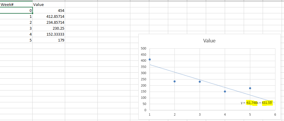
In the screen shot above, the average values range from 179 to 454, and when I export the data to Excel and create a scatter chart with a linear trendline, I see that the slope value is -61.748 and the y-intercept is 431.59. These are the values I am expecting to get from the linest_m and linest_b functions in Qlik Sense.
Any help would be appreciated.
Regards,
Richard

