Unlock a world of possibilities! Login now and discover the exclusive benefits awaiting you.
- Qlik Community
- :
- Forums
- :
- Analytics & AI
- :
- Products & Topics
- :
- App Development
- :
- Remove zero values from maps
- Subscribe to RSS Feed
- Mark Topic as New
- Mark Topic as Read
- Float this Topic for Current User
- Bookmark
- Subscribe
- Mute
- Printer Friendly Page
- Mark as New
- Bookmark
- Subscribe
- Mute
- Subscribe to RSS Feed
- Permalink
- Report Inappropriate Content
Remove zero values from maps
Hi there,
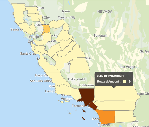
I am using the color by measure feature in a Qlik Sense map chart and I only want to show data that is >0. Unfortunately, Qlik is mapping areas that contain 0 values, making it look like there is data where there isn't. I've tried to change the Range to Custom with the Min at 1 and the Max at Max([Reward Amount]) but it is still showing 0s. These are not NULL values, they are calculated at 0 using an expression (Yes, I've tried un-checking the 'Include null values' box). Is there a way to omit zeros from the maps? This makes the color by measure option virtually useless for mapping calculated data.
I have also tried using an if() statement to only include values >0 but it just grays out the areas with 0s, it doesn't remove them (see 2nd image below).

- « Previous Replies
-
- 1
- 2
- Next Replies »
- Mark as New
- Bookmark
- Subscribe
- Mute
- Subscribe to RSS Feed
- Permalink
- Report Inappropriate Content
- « Previous Replies
-
- 1
- 2
- Next Replies »