Unlock a world of possibilities! Login now and discover the exclusive benefits awaiting you.
- Qlik Community
- :
- Forums
- :
- Analytics & AI
- :
- Products & Topics
- :
- App Development
- :
- Re: Scatter Plot chart - date on x-axis
- Subscribe to RSS Feed
- Mark Topic as New
- Mark Topic as Read
- Float this Topic for Current User
- Bookmark
- Subscribe
- Mute
- Printer Friendly Page
- Mark as New
- Bookmark
- Subscribe
- Mute
- Subscribe to RSS Feed
- Permalink
- Report Inappropriate Content
Scatter Plot chart - date on x-axis
Hi,
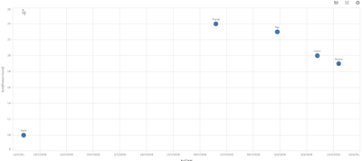
I would like to create a Scatter Plot with date on x-axis, Product Count on Y-axis and dimension: Product Type.
Please see sample data and screen of Scatter Plot. It is creating strange view - I am able to see only one product.
Probably the problem is with Date on x-axis, as it should be measure, but I have no idea how to resolve it.
Thanks in advance for your help.
Regards,
Zela
Accepted Solutions
- Mark as New
- Bookmark
- Subscribe
- Mute
- Subscribe to RSS Feed
- Permalink
- Report Inappropriate Content
For a scatter plot, you need at least 2 measures.
With your simple data set, x-axis could be Avg(Date), y-axis could be Sum([Product Count]), dimension [Product type]
- Mark as New
- Bookmark
- Subscribe
- Mute
- Subscribe to RSS Feed
- Permalink
- Report Inappropriate Content
For a scatter plot, you need at least 2 measures.
With your simple data set, x-axis could be Avg(Date), y-axis could be Sum([Product Count]), dimension [Product type]
- Mark as New
- Bookmark
- Subscribe
- Mute
- Subscribe to RSS Feed
- Permalink
- Report Inappropriate Content
Thanks a lot Lisa_P.
I didn't know that I could apply Avg to Date. It seems working fine now 🙂
Regards,
Zuzanna Karwala
