Unlock a world of possibilities! Login now and discover the exclusive benefits awaiting you.
- Qlik Community
- :
- Forums
- :
- Analytics & AI
- :
- Products & Topics
- :
- App Development
- :
- Scatter plot : fourth dimension
- Subscribe to RSS Feed
- Mark Topic as New
- Mark Topic as Read
- Float this Topic for Current User
- Bookmark
- Subscribe
- Mute
- Printer Friendly Page
- Mark as New
- Bookmark
- Subscribe
- Mute
- Subscribe to RSS Feed
- Permalink
- Report Inappropriate Content
Scatter plot : fourth dimension
Good afternoon,
I'm a new Qliksense user (3 hours of experience), I am not a developer but I am user with strategic tools like Planisware, SAP xRPM, etc...for business purpose
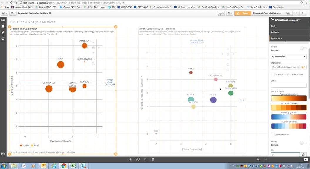
In the context of presenting bubble charts (called Scatter plot in your tool) to support and facilitate the decision making process of the board of directors, I would like to display a scatter plot with 4 dimensions (color being a measure).
I have successfully created the X,Y, Size measures, with the right scaling, legends etc... but I am blocked with the color...
The "availability of expertise" is the measure I want to display as a color for the several applications of my portfolio (We intend to make decisions across a huge portfolio of IT applications).
Each application (dimension of my chart being the title of the application) has got one measure of availability of expertise (from 1 to 6)
My purpose is to have the applications with an expertise at 0 having a black bubble color; 1 : dark blue, 2 : dark green, 3 : red 4 amber ; 5 yellow 6 : white
That's all !!!
if((Avg[Global Availability of Expertise] = 1),Black(),
if((Avg[Global Availability of Expertise] = 2),Grey(),
if((Avg[Global Availability of Expertise]>2),White())))
or also :
if(([Global Availability of Expertise] = 1),Black(),
if(([Global Availability of Expertise] = 2),Grey(),
if(([Global Availability of Expertise]>2),White())))
But nothing is working.... all the bubbles are grey 😞
Could somebody provides me with an answer for this simple but key question (as it is required for all the graphs I 'm going to display...)
- Mark as New
- Bookmark
- Subscribe
- Mute
- Subscribe to RSS Feed
- Permalink
- Report Inappropriate Content
Under Colors & Legend, Select "By Expression" and specify something like:
=pick([Global Availability of Expertise]+1,black(),blue(),green(),red(),rgb(200,100,0),yellow(),white())
- Mark as New
- Bookmark
- Subscribe
- Mute
- Subscribe to RSS Feed
- Permalink
- Report Inappropriate Content
Dear Steven,
Many thanks for the piece of advice 🙂
I have tried but without success....
Enclose, the answer from one of the QlikSense expert :
Hi Eric, Yes that feature is not present in Qliksense 3 ( the version we have). It is available from Qliksense November 2017 version. So far I don't know when our team QlikSense support could upgrade.
Probably we can find somehow a workaround.
- Mark as New
- Bookmark
- Subscribe
- Mute
- Subscribe to RSS Feed
- Permalink
- Report Inappropriate Content
We use Qlik Sense 3.2 and it definitely works and pretty sure it was in 3.0 as we've been doing a over/under coloring on scatter plots since we launched a couple years ago.
We use hex colors not the functions, so that may be the difference and a simple if, but no reason a pick wouldn't work. I tend to test the pick using a text control, just to make sure if resolves to the correct value.
- Mark as New
- Bookmark
- Subscribe
- Mute
- Subscribe to RSS Feed
- Permalink
- Report Inappropriate Content
Gentlemen, you have made my day 🙂 The pick is indeed working !!
Now, some extra enhancement to fine tune it and to prepare the first prototype of senior management report:-)