Unlock a world of possibilities! Login now and discover the exclusive benefits awaiting you.
- Qlik Community
- :
- Forums
- :
- Analytics & AI
- :
- Products & Topics
- :
- App Development
- :
- Sense Line Graph not drawing lines between all dat...
- Subscribe to RSS Feed
- Mark Topic as New
- Mark Topic as Read
- Float this Topic for Current User
- Bookmark
- Subscribe
- Mute
- Printer Friendly Page
- Mark as New
- Bookmark
- Subscribe
- Mute
- Subscribe to RSS Feed
- Permalink
- Report Inappropriate Content
Sense Line Graph not drawing lines between all data points?
Updated to June 2020 a month ago and now have strange behavior in one line graph.
Have a community sheet with a line graph using many categories.
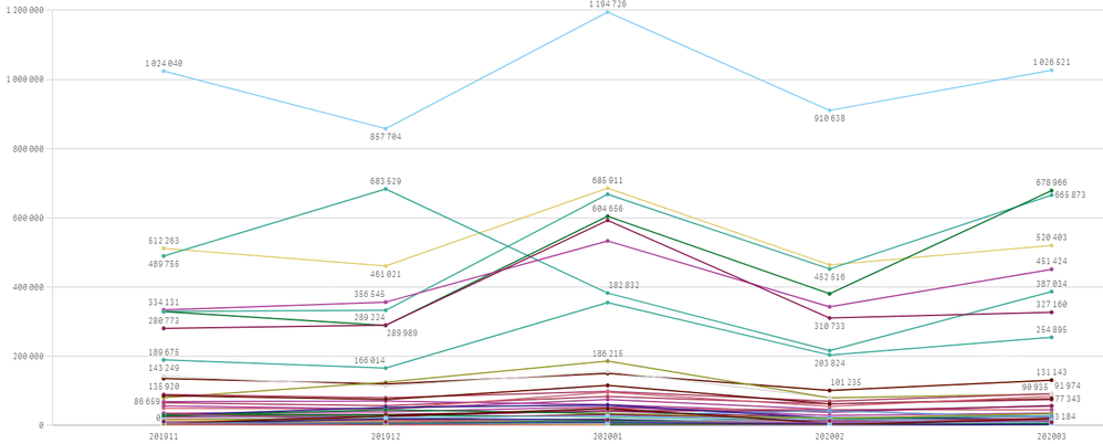
One selection of YearMonths it looks fine;
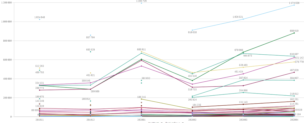
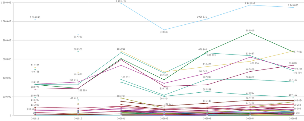
extending it to more YearMonths the graph stops drawing some lines?
Another selection of YearMonths the break is at a different point;

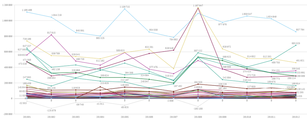
Selecting a greater historical span of YearMonths before 2020 it shows all lines.
Looks like Sense is limiting the number of things drawn to limit the strain on resources but skipping the lines while plotting all the labels is the wrong path!
Anyone experienced this and have a clue what is going on?
- Mark as New
- Bookmark
- Subscribe
- Mute
- Subscribe to RSS Feed
- Permalink
- Report Inappropriate Content
Hi,
Check in your Expression was there any year restriction,
For ex:
if you have 5 measures based on Yearmonth dimension,
three measures had No year restriction and another Two measures had Year restriction.
in this condition what ever yearmonth you have selected, in chart all dimension shows but measures will be shows with respect to your selection. that time line continuity may missing.
why because your issues starts before starting of year so,
or otherwise check your data Date format,
- Mark as New
- Bookmark
- Subscribe
- Mute
- Subscribe to RSS Feed
- Permalink
- Report Inappropriate Content
Now you are not looking properly at the screen dumps!
All measures are plotted, you still have the data points but the lines connecting the data points are omitted!
Compare picture one and two, in the top left corner are three data points.
In the first picture they are connected, in the second picture they are not but should.