Unlock a world of possibilities! Login now and discover the exclusive benefits awaiting you.

Announcements
Share your agentic AI experience, learn from others, and earn a new badge: Put Agentic AI to Work
- Qlik Community
- :
- Forums
- :
- Analytics & AI
- :
- Products & Topics
- :
- App Development
- :
- Specific Graph Presentation Question
Options
- Subscribe to RSS Feed
- Mark Topic as New
- Mark Topic as Read
- Float this Topic for Current User
- Bookmark
- Subscribe
- Mute
- Printer Friendly Page
Turn on suggestions
Auto-suggest helps you quickly narrow down your search results by suggesting possible matches as you type.
Showing results for

 roelvyvey
Partner - Contributor
2018-01-29
11:29 AM
- Mark as New
- Bookmark
- Subscribe
- Mute
- Subscribe to RSS Feed
- Permalink
- Report Inappropriate Content
Specific Graph Presentation Question
Dear Community,
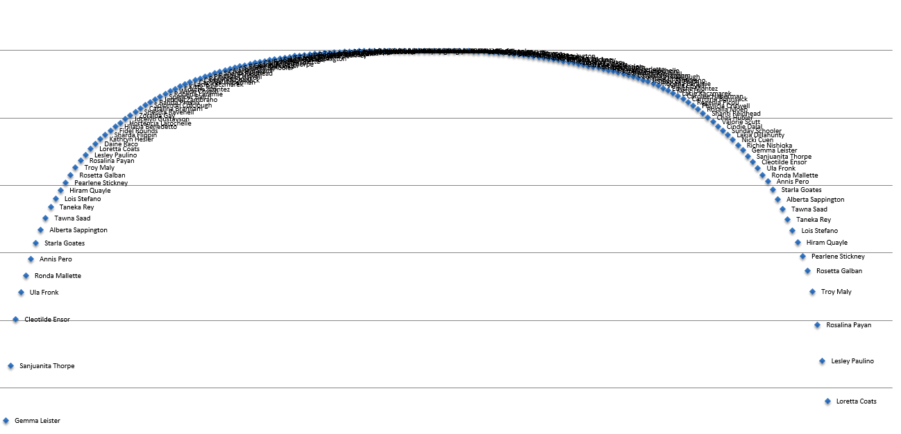
I'm having problems presenting the data the way it's presented in the attached screenshot.
Several problems:
- How to display only dots as value points
- How to attach the label to it
- When plotting the values currently the chart displays a scrollbar but the continuous x-axis cannot be disabled ( probably due to too much values?). How do I make sure that all of the data is displayed without the scroll.
Is there any way this graph can be realized or should I be seeking an other solution?
Kind regards,
Roel
532 Views
0 Replies
