Unlock a world of possibilities! Login now and discover the exclusive benefits awaiting you.
- Qlik Community
- :
- Forums
- :
- Analytics & AI
- :
- Products & Topics
- :
- App Development
- :
- Specifying multiple colors in color expressions
- Subscribe to RSS Feed
- Mark Topic as New
- Mark Topic as Read
- Float this Topic for Current User
- Bookmark
- Subscribe
- Mute
- Printer Friendly Page
- Mark as New
- Bookmark
- Subscribe
- Mute
- Subscribe to RSS Feed
- Permalink
- Report Inappropriate Content
Specifying multiple colors in color expressions
I'm trying to use color expressions for a combo chart based on filter criteria in QLIK SENSE.
I can get the filter criteria to change the color, but no matter what I do, all the bars and lines in the combo chart are the same color.
Here's an example of what I'd like to do:
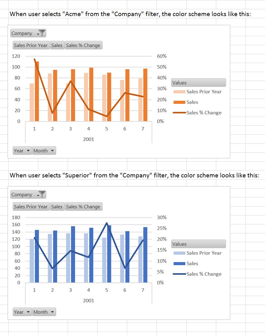
The combo chart has 3 metrics (sales prior year, sales current year, and percent change), one dimension (month), and one filter (company).
1. If "Acme Corp" is selected in the "Company" filter, then the first metric is light blue (#8888ff), second metric is medium blue (#0000ff) and the third metric is dark blue (#000088)
2. If "Superior Corp" is selected in the "Company" filter, then the first metric is light red (#ff8888), second metric is medium red (#ff0000) and the third metric is dark red (#880000)
3. If neither, or both, are selected the first metric is light grey (#cccccc), second metric is medium grey (#888888) and the third metric is dark grey (#555555)
Is it possible to do this? Can I do it using the order of the metrics, or do I need to specify the metric names? (The former is more general and thus easily copied and pasted)
Thank for any ideas!
- Mark as New
- Bookmark
- Subscribe
- Mute
- Subscribe to RSS Feed
- Permalink
- Report Inappropriate Content
Select dimension & put this expression in background color.
= if (Company = 'Acme Corp' ,LightBlue(),LightCyan())
Thank you!
- Mark as New
- Bookmark
- Subscribe
- Mute
- Subscribe to RSS Feed
- Permalink
- Report Inappropriate Content
Please share you data or app for better understanding.
Thank you!
- Mark as New
- Bookmark
- Subscribe
- Mute
- Subscribe to RSS Feed
- Permalink
- Report Inappropriate Content
Ishteep,
Thanks for looking into this for me!
The challenge is that "Company" is not a dimension in the chart at all. It is only a filter on the sheet.
I quickly mocked this up in Excel Pivot Charts. (I had to change the colors manually of course. This is just for illustration.)
Let me know if this helps clarify the question.
