Unlock a world of possibilities! Login now and discover the exclusive benefits awaiting you.
- Qlik Community
- :
- Forums
- :
- Analytics & AI
- :
- Products & Topics
- :
- App Development
- :
- Stacked Bar Chart Sort Order
- Subscribe to RSS Feed
- Mark Topic as New
- Mark Topic as Read
- Float this Topic for Current User
- Bookmark
- Subscribe
- Mute
- Printer Friendly Page
- Mark as New
- Bookmark
- Subscribe
- Mute
- Subscribe to RSS Feed
- Permalink
- Report Inappropriate Content
Stacked Bar Chart Sort Order
Folks,
I have a stacked bar chart that looks like this
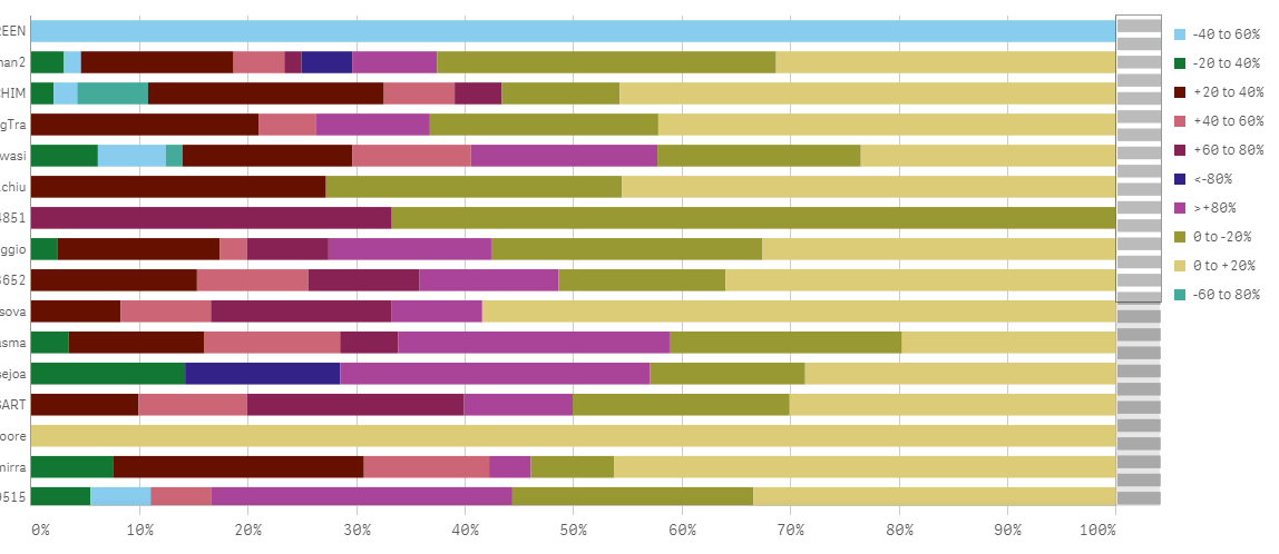
I really want to order the colours so they are in numerical order. So we start with "<=80%", then "-80 to 60%" etc, ending up with ">=+80%".
I have uploaded my bands as a separate table as I am doing an Interval Match on the value, so I added a column for DiscountBandSortOrder, but I cant seem to get it to work. The Dimensions for the chart are Underwriter and Discount Band and the formula for the Measure is:
count({$<QuoteSystemStatus={'Issued','Finalised'},DateFirstQuoteReceived={'>=$(=addmonths(max(DateFirstQuoteReceived),-3))'}>}QuoteID) /
count(total<Underwriter>{$<QuoteSystemStatus={'Issued','Finalised'},DateFirstQuoteReceived={'>=$(=addmonths(max(DateFirstQuoteReceived),-3))'}>}QuoteID)
So it counts % of the number of QuoteIDs in each DiscountBand compared to the total for that Underwriter in the last 3 months.
What should I use for the expression in the Sort section to get the right order?
Many thanks
Chris
- Mark as New
- Bookmark
- Subscribe
- Mute
- Subscribe to RSS Feed
- Permalink
- Report Inappropriate Content
I have the same issue... I have tried to even change the sequence in which data is loaded by the script, modified my data tables in Excel... it seems there is no way for the chart developer on how to change the sequence of the segments of the stacked bar are displayed.
I have played also with the Sorting feature for each dimension, it helped a bit but it never ends up in a logical way...
- Mark as New
- Bookmark
- Subscribe
- Mute
- Subscribe to RSS Feed
- Permalink
- Report Inappropriate Content
It seems to me that most likely your problem to sort the bar segments is not as simple, but I think I need to tell you how I solved my sorting issue.
My measures did not have any order. For certain data sets, if I turned off the Auto Sort in the chart, that was enough because they were loaded by the script in order of appearance. But for a certain stacked bar chart that involves a CrossTable feature at load script, this was not working. As I said above, moving around columns in my data set helped a bit but unpredictably. I really needed to make it work, so I added a number to my data set dimensions in front and used the Sorting feature of the chart in Alphabetical order. And it worked just fine.
I went through a lot of scripting try-and-fail, many weeks of that... generated the charts in many different ways, but the simplest of solutions was there a bit hidden and I could not see it from the very beginning.
As I said, this might not be possible for you, but it worked for me.
Good luck!
- Mark as New
- Bookmark
- Subscribe
- Mute
- Subscribe to RSS Feed
- Permalink
- Report Inappropriate Content
Hi
See this approach using match fonction :
https://community.qlik.com/thread/235804
add this in sortorder panel :
match(YourDimension,'<=80%','-80 to 60%','-60 to 80%','-40 to 60%','-20 to 40%','etc','etc' ... )
Hope it helps
Bruno
- Mark as New
- Bookmark
- Subscribe
- Mute
- Subscribe to RSS Feed
- Permalink
- Report Inappropriate Content
You can try using a calculated dimension using the dual function so you can sort the dimension numerically. See attached example.
talk is cheap, supply exceeds demand
- Mark as New
- Bookmark
- Subscribe
- Mute
- Subscribe to RSS Feed
- Permalink
- Report Inappropriate Content
Thanks, Bruno!
I used that match function to generate the order but somehow it did not work with one of the bar segments, no idea why.
My last resource was to modify the name of the measures and that worked perfectly. As I said, not optimal, but it worked.
- Mark as New
- Bookmark
- Subscribe
- Mute
- Subscribe to RSS Feed
- Permalink
- Report Inappropriate Content
Wow, Gysbert!
That was an elegant way to solve it!
However, that is not yet my level - I need to study more to understand how you achieved that with only just a few lines...
aggr(
dual(
only(Customer)
,sum(Amount)
)
,Year,Customer)
Thanks!
(BTW, I did not post this question, so I cannot mark it as solved)