Unlock a world of possibilities! Login now and discover the exclusive benefits awaiting you.

- Qlik Community
- :
- Forums
- :
- Analytics & AI
- :
- Products & Topics
- :
- App Development
- :
- Stacked bar chart that adds 100% from multiple col...
- Subscribe to RSS Feed
- Mark Topic as New
- Mark Topic as Read
- Float this Topic for Current User
- Bookmark
- Subscribe
- Mute
- Printer Friendly Page

- Mark as New
- Bookmark
- Subscribe
- Mute
- Subscribe to RSS Feed
- Permalink
- Report Inappropriate Content
Stacked bar chart that adds 100% from multiple columns
Given the following data, how can i produce a graph that shows:
| CAT | MONTH | F1 | F2 | F3 |
| 1 | 1 | 1 | ||
| 1 | 1 | 6 | ||
| 1 | 1 | 4 | ||
| 1 | 1 | 2 | ||
| 2 | 1 | 3 | ||
| 2 | 1 | 4 | ||
| 2 | 1 | 5 | ||
| 2 | 2 | 2 | ||
| 2 | 2 | 3 | ||
| 3 | 2 | 5 | ||
| 3 | 2 | 6 | ||
| 3 | 2 | 7 | ||
| 3 | 2 | 8 | ||
| 3 | 2 | 9 | ||
| 3 | 3 | 1 | ||
| 4 | 3 | 2 | ||
| 4 | 3 | 3 | ||
| 4 | 3 | 4 | ||
| 4 | 3 | 5 | ||
| 5 | 3 | 6 |
The Column CAT as a dimension
The Column Month as a sub-dimension
The Sum of F1+F2+F3 as a stacked bar chart, that always has a total of 100%
- Tags:
- chart bar

 sunny_talwar
- Mark as New
- Bookmark
- Subscribe
- Mute
- Subscribe to RSS Feed
- Permalink
- Report Inappropriate Content
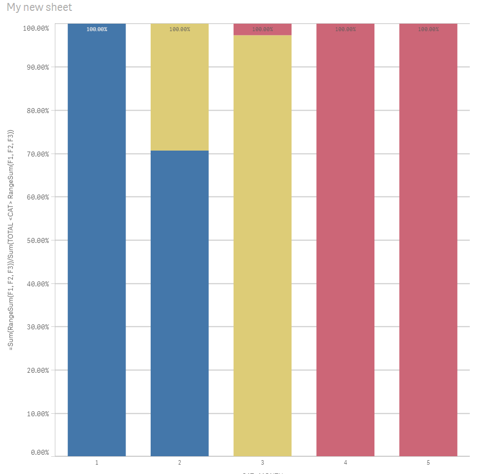
May be this
=Sum(RangeSum(F1, F2, F3))/Sum(TOTAL <CAT> RangeSum(F1, F2, F3))
- Mark as New
- Bookmark
- Subscribe
- Mute
- Subscribe to RSS Feed
- Permalink
- Report Inappropriate Content
Hi,
That's almost it, there's only one point that i didn't explain in my opening post.
The Sum of F1 should only be calculated when the month=1.
The Sum of F2 should only be calculated when the month=2.
The Sum of F3 should only be calculated when the month=3.
I modified my example data, only the values in bold should be calculated:
| CAT | MONTH | F1 | F2 | F3 |
| 1 | 1 | 1 | 2 | 5 |
| 1 | 1 | 6 | 3 | 6 |
| 1 | 1 | 4 | 5 | 7 |
| 1 | 1 | 2 | 6 | 8 |
| 2 | 1 | 3 | 7 | 3 |
| 2 | 1 | 4 | 8 | 2 |
| 2 | 1 | 5 | 3 | 3 |
| 2 | 2 | 2 | 2 | 5 |
| 2 | 2 | 3 | 3 | 6 |
| 3 | 2 | 5 | 5 | 7 |
| 3 | 2 | 6 | 6 | 8 |
| 3 | 2 | 7 | 7 | 9 |
| 3 | 2 | 8 | 8 | 7 |
| 3 | 2 | 9 | 9 | 2 |
| 3 | 3 | 3 | 7 | 1 |
| 4 | 3 | 5 | 8 | 2 |
| 4 | 3 | 6 | 9 | 3 |
| 4 | 3 | 7 | 2 | 4 |
| 4 | 3 | 8 | 3 | 5 |
| 5 | 3 | 8 | 5 | 6 |
sunny_talwar
- Mark as New
- Bookmark
- Subscribe
- Mute
- Subscribe to RSS Feed
- Permalink
- Report Inappropriate Content
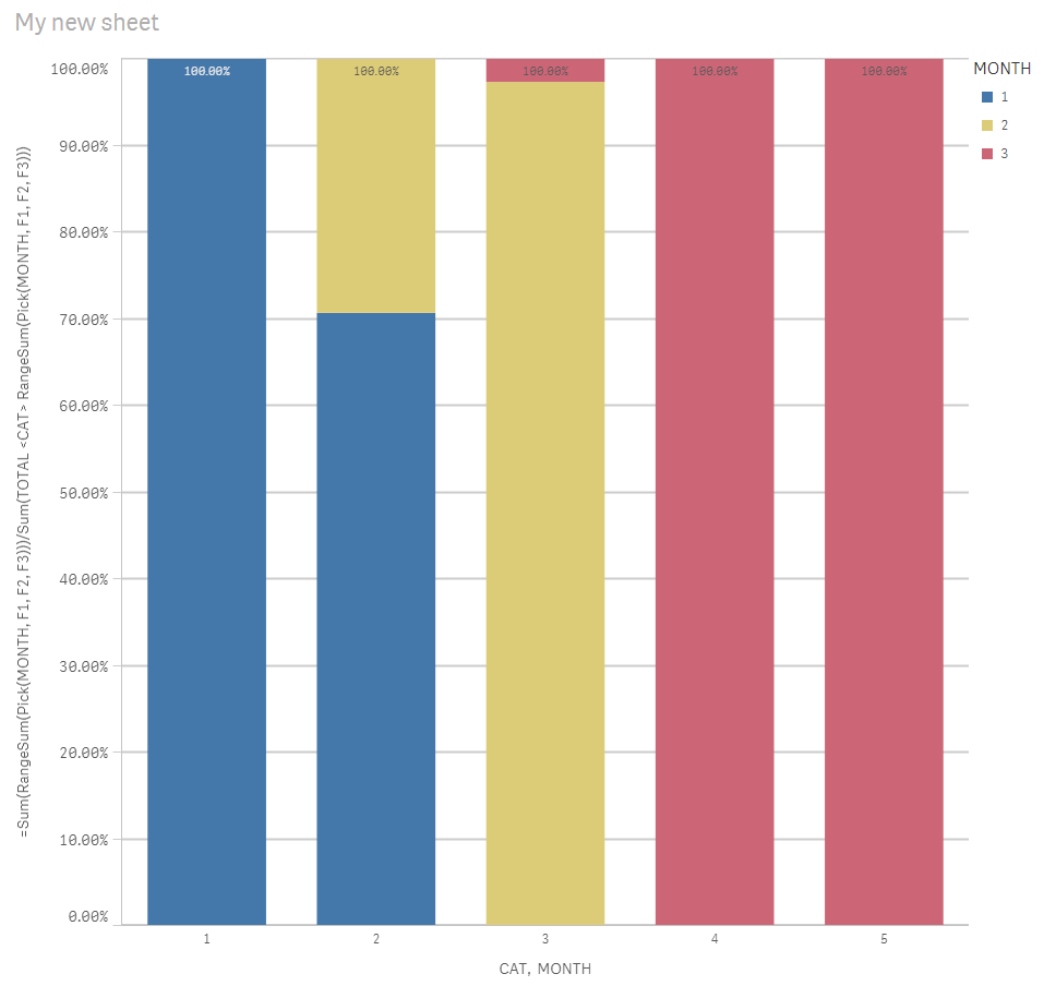
May be like this
=Sum(RangeSum(Pick(MONTH, F1, F2, F3)))/Sum(TOTAL <CAT> RangeSum(Pick(MONTH, F1, F2, F3)))
sunny_talwar
- Mark as New
- Bookmark
- Subscribe
- Mute
- Subscribe to RSS Feed
- Permalink
- Report Inappropriate Content
Sample attached