Unlock a world of possibilities! Login now and discover the exclusive benefits awaiting you.
- Qlik Community
- :
- Forums
- :
- Analytics & AI
- :
- Products & Topics
- :
- App Development
- :
- Using condition to change expression on Qlik Sense...
- Subscribe to RSS Feed
- Mark Topic as New
- Mark Topic as Read
- Float this Topic for Current User
- Bookmark
- Subscribe
- Mute
- Printer Friendly Page
- Mark as New
- Bookmark
- Subscribe
- Mute
- Subscribe to RSS Feed
- Permalink
- Report Inappropriate Content
Using condition to change expression on Qlik Sense charts
Hi everyone,
I am trying to create a chart that alternate expressions based on field selections using a formula similar to this one.
If( GetSelectedCount( Year )=0 and GetSelectedCount( Month_Year )=0,
Sum( {< Date= {">=$(vMin_Date)<=$(vMax_Date)"} >} Value), Sum( Value) )
I basically want to restrict my data within a range when there are no selections made to the year and month_year fields.
This condition works perfectly in tables and KPI objects, however, it behaves in a strange way in charts. When there are no selections made in the year and month_year fields, the only values shown are in the range determined in the set analysis, but, all the other dates still appear with zero values. Like shown in the image below.
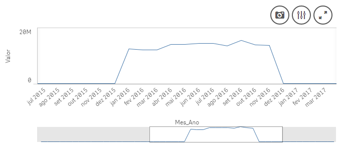
Note that there are values for all periods in my data model.
Anyone has any insights on why this might be happening?
Thank you very much!
Stefano Draghi
Accepted Solutions
- Mark as New
- Bookmark
- Subscribe
- Mute
- Subscribe to RSS Feed
- Permalink
- Report Inappropriate Content
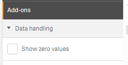
Have you tried unchecking 'Show zero values' under Add-ons? This is checked by default.
- Mark as New
- Bookmark
- Subscribe
- Mute
- Subscribe to RSS Feed
- Permalink
- Report Inappropriate Content
Have you tried unchecking 'Show zero values' under Add-ons? This is checked by default.
- Mark as New
- Bookmark
- Subscribe
- Mute
- Subscribe to RSS Feed
- Permalink
- Report Inappropriate Content
Hi Sunny, thank you for the fast answer.
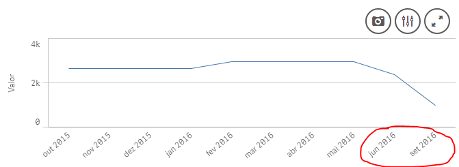
Unchecking the box does work, however, it also hides zero values within the 12 months range I established. In the example below, my analysis ended up a little bit distorted because July and August don't show up.
- Mark as New
- Bookmark
- Subscribe
- Mute
- Subscribe to RSS Feed
- Permalink
- Report Inappropriate Content
Use an if statement to assign a value of 0.00001 to those which are within your range?
If( GetSelectedCount( Year )=0 and GetSelectedCount( Month_Year )=0,
If(Sum( {< Date= {">=$(vMin_Date)<=$(vMax_Date)"} >} Value) = 0, 0.000001,
Sum( {< Date= {">=$(vMin_Date)<=$(vMax_Date)"} >} Value)), Sum( Value) )
- Mark as New
- Bookmark
- Subscribe
- Mute
- Subscribe to RSS Feed
- Permalink
- Report Inappropriate Content
Hi Sunny,
The second if statement doesn't really work in my case, but it's not a problem. Since the cases where the values will be zero are exceptions, unchecking the show zero values box will be sufficient.
Thank you very much again.