Unlock a world of possibilities! Login now and discover the exclusive benefits awaiting you.
- Qlik Community
- :
- Forums
- :
- Analytics & AI
- :
- Products & Topics
- :
- App Development
- :
- Values/Labels in TreeMap chart
- Subscribe to RSS Feed
- Mark Topic as New
- Mark Topic as Read
- Float this Topic for Current User
- Bookmark
- Subscribe
- Mute
- Printer Friendly Page
- Mark as New
- Bookmark
- Subscribe
- Mute
- Subscribe to RSS Feed
- Permalink
- Report Inappropriate Content
Values/Labels in TreeMap chart
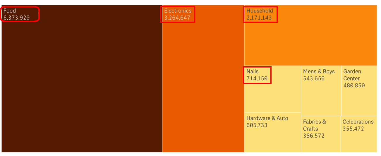
I need to include a TreeMap chart into my application but here is one thing I've noticed: Values and Labels are not adjusting much after the object get resized or number of cells is changing:
Here is how chart looks in "regular" size:

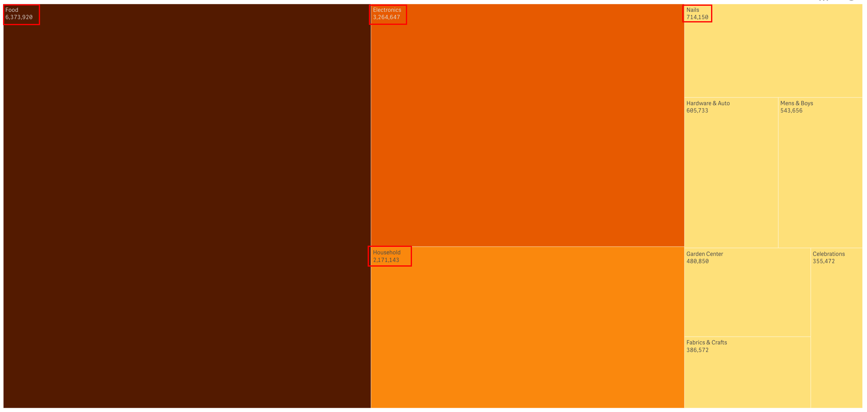
Labels and Values are kind of small and there is no option to change the font or layout (they are always left-justified to the upper left corner of the cell)....
It looks much worse if you Maximize the chart:

So I am looking for solution to change the font size along with text layout and location. Have checked the Brunch - not much there... ![]()
And the "bonus" question: anybody can explain why Qlik has renamed the BlockChart in QlikView to TreeMap in QlikSense??? ![]()
Appreciate your suggestions/comments...
Vlad
- Mark as New
- Bookmark
- Subscribe
- Mute
- Subscribe to RSS Feed
- Permalink
- Report Inappropriate Content
Found an answer to my second "bonus" question ![]()
From hic:
____________________________________________________________________________________________
"Treemap" is the most common name in English for this chart type. The reason it is called this way is that it originally was used to show hierarchies; tree structures.
When we introduced this chart for version 7, we considered calling it "Treemap", but chose to call it "Block chart" instead. Partly because "Treemap" is poor name (from a descriptive point), partly because the chart often is used for structures that are not tree-like.
For Qlik Sense we have chosen to call it "Treemap", since this is the accepted name in English, and we wanted to be conform with the standard terminology. However, this change does not necessarily mean that translations into other languages should change."
____________________________________________________________________________________________
VK
- Mark as New
- Bookmark
- Subscribe
- Mute
- Subscribe to RSS Feed
- Permalink
- Report Inappropriate Content
Hi Vlad,
have you got solutions for this issue. I am also facing the same.
- Mark as New
- Bookmark
- Subscribe
- Mute
- Subscribe to RSS Feed
- Permalink
- Report Inappropriate Content
same problem here .........