Unlock a world of possibilities! Login now and discover the exclusive benefits awaiting you.
- Qlik Community
- :
- Forums
- :
- Analytics & AI
- :
- Products & Topics
- :
- App Development
- :
- average YTD as at x month in a table
- Subscribe to RSS Feed
- Mark Topic as New
- Mark Topic as Read
- Float this Topic for Current User
- Bookmark
- Subscribe
- Mute
- Printer Friendly Page
- Mark as New
- Bookmark
- Subscribe
- Mute
- Subscribe to RSS Feed
- Permalink
- Report Inappropriate Content
average YTD as at x month in a table
Hi,
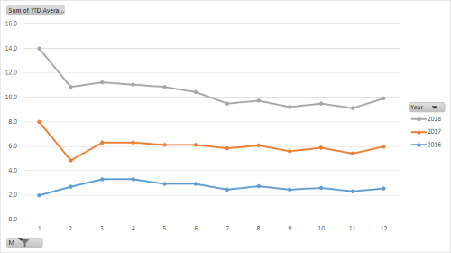
I would like to build a line chart that displays average score YTD as at X month as below
The raw data looks like this
| Id | Date | Score |
| 1 | 05-01-16 | 4 |
| 2 | 06-01-16 | 4 |
| 6 | 06-03-16 | 1 |
| 14 | 06-01-17 | 4 |
| 17 | 26-02-17 | 2 |
| 18 | 06-03-17 | 3 |
| 19 | 15-12-17 | 2 |
| 25 | 05-01-18 | 4 |
| 26 | 06-01-18 | 1 |
| 28 | 05-02-18 | 1 |
| 29 | 26-02-18 | 4 |
The desired outcome is as follows
Year-Month Average Score
Jan 2016 Avg(Jan 2016)
Mar 2016 Avg(Jan-Mar 2016)
Jan 2017 Avg(Jan 2017)
Dec 2017 Avg(Jan-Dec 2017)
I have been trying to use set analysis formula but failed, probably my coding is not right. Can someone help me?
The sample data set is attached in excel
- Tags:
- average ytd
- Mark as New
- Bookmark
- Subscribe
- Mute
- Subscribe to RSS Feed
- Permalink
- Report Inappropriate Content
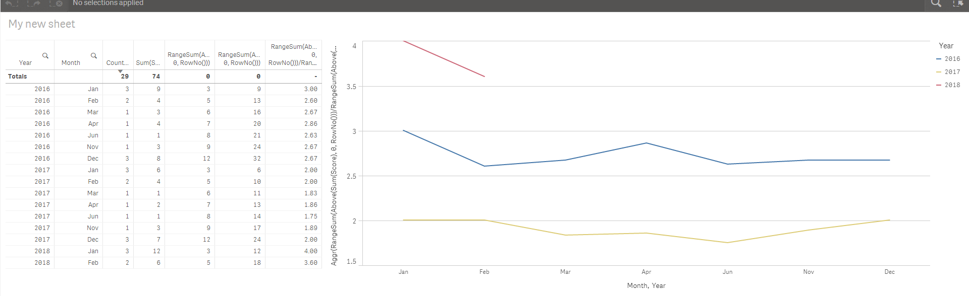
Try using this expression
Aggr(RangeSum(Above(Sum(Score), 0, RowNo()))/RangeSum(Above(Count(Id), 0, RowNo())), Year, Month)
- Mark as New
- Bookmark
- Subscribe
- Mute
- Subscribe to RSS Feed
- Permalink
- Report Inappropriate Content
Thank Sunny,
Is there any way I can do it using Avg and set analysis expression for this problem?
- Mark as New
- Bookmark
- Subscribe
- Mute
- Subscribe to RSS Feed
- Permalink
- Report Inappropriate Content
Average might work, but why set analysis? not sure I understand? Is something not working with the current expression?