In many of the demos that I have done, I have added a customizable straight table or ad-hoc report where the user can select the dimensions and measures that should appear in the chart. This is often helpful and can replace multiple detailed straight tables in an application. Creating the customizable chart involves simply loading the dimensions and measures that the users can pick from and then adding a straight table with conditional dimensions and expressions.
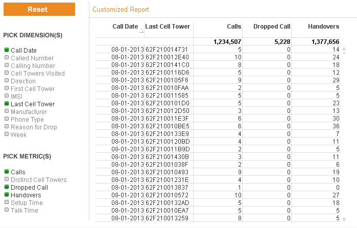
In the Call Detail Record Analysis demo a customized report was added to the application. This is how the ad-hoc report looks with some dimensions and metrics selected.
The steps taken to build this report were:
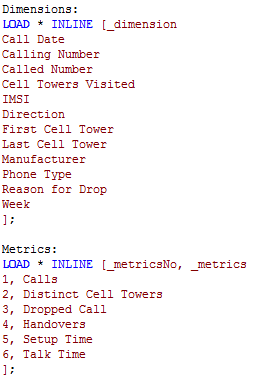
Load dimensions and metrics that should appear in the list box for the user to choose from. In this example, this was done by adding two inline tables with the script below.
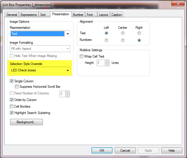
Then list boxes for _dimension and _metrics were added to the report sheet with the LED Check boxes selection style.
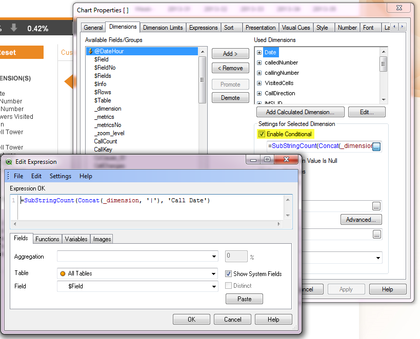
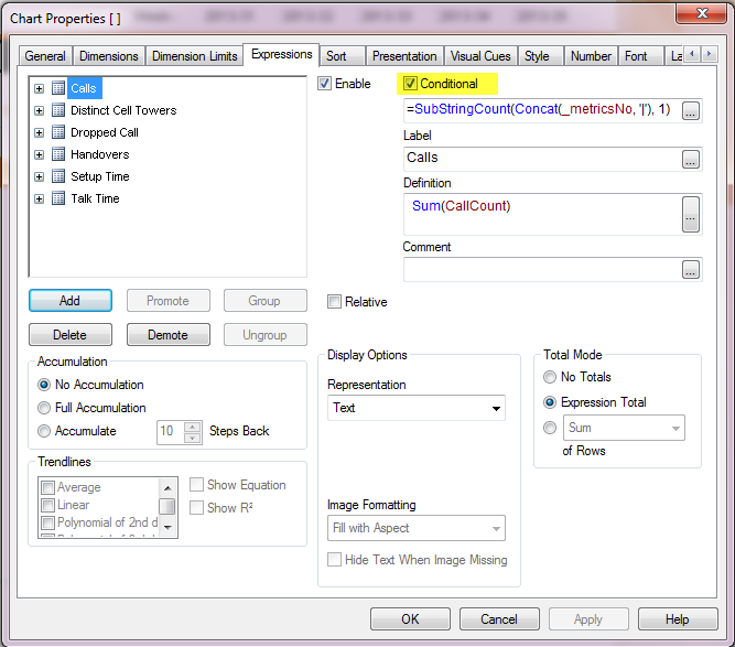
Next a straight table is added to the sheet with the following conditional calculation:
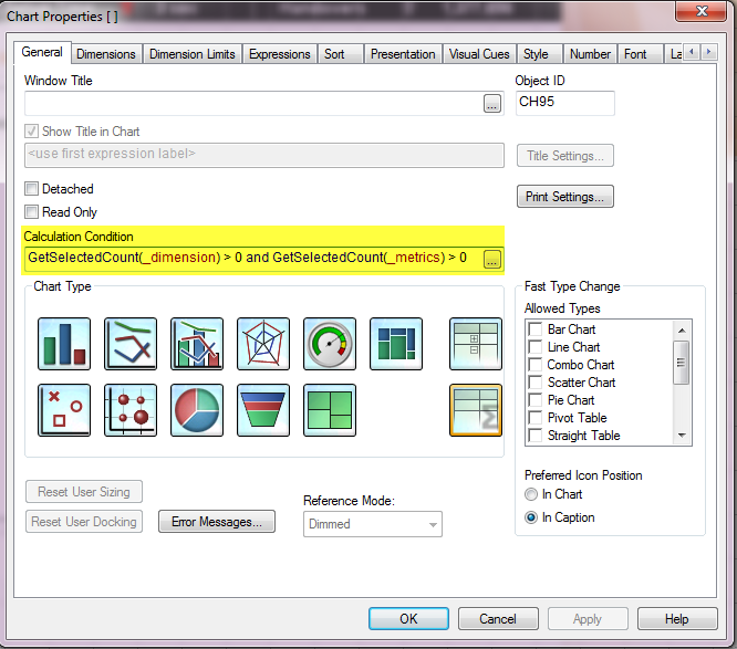
The chart will be displayed if at least 1 dimension and 1 metric are selected from the list boxes.
Next the dimensions were added to the table. Each dimension in the list box was added to the chart with a conditional expression so that the dimension is only displayed if it is selected from the Dimensions list box.
The same was done for each measure listed.
In five easy steps, a customizable straight table or report can be added to your QlikView application providing users the ability to display a report with the data they want to see at the time. This gives the user more flexibility and reduced the need to add detailed straight table charts to the sheets in the application.
You can read more about this topic in my Technical Brief which has more detailed step-by-step instructions. Have fun!
We've used this technique in a number of places though with a slight modification. We load the dimensions and metrics from a spreadsheet. This spreadsheet is loaded as two island tables, one for dimensions and one for metrics. Then in addition to using references to the list boxes for show conditions, we call back to the island table for the dimension and expression formulas as well. Basically the entire table made of calculated values, dimensions, labels, expressions, showconditions, etc.
In this way we can migrate the tool from one application to another very easily. Paste in a few objects, a chunk of script, and update the spreadsheet and it's all ready. A highly end user customizable report. Stack that with shared bookmarks and our end users have never been happier. A big thanks to kyle_frye and DI Squared for helping to set up the first one!
We're all doing the same thing here, but I'll share with you the specifics of my approach, as it may have certain advantages over other approaches described.
As usual, I create two island tables: First for dimensions and the second for measures.
Tip #1: use a hide prefix or suffix so these selections don't show up in Current Selections.
Tip #2: use REPLACE for partial reloads (useful for adding new measures without having to do full reloads - partial reloads should only be used for testing, since the Load order isn't what I normally Expect
Tip #3: Order the dimensions and measures according to user query patterns. Namely, put most frequently accessed dimensions and measures near top of list. Then, in your List Boxes short by "Original Load Order"
Example:
[Dimension Selector]:
Replace
LOAD * Inline [
Dimension Name%
Example Dimension Field
Example Second Dimension Field
];
[Expression Selector]:
Replace
LOAD * Inline [
Expression Name%
Min Trans
Max Trans
Median Trans
];
You can then define two variables, which are both parameter driven:
Then in each of the dimension and expression Conditional expressions, set the expression as follows to bind a given dimension or measure to the respective Dimension
e.g.
$(ShowDimension('Example Dimension Field'))
For expressions
e.g.
$(ShowExpression('Min Trans'))
With this approach it is relatively easy to specify and maintain bindings between dimension selectors and their respective Chart Dimensions, and between measures and their respective Chart Expressions. I like using the parameter driven variable since it is much more readable and less error prone when you're in the Chart properties wiring up the chart.
One last tip: I allow users to fast change between Pivot Table and Straight Table, and leave the default as Pivot Table. This gives the best "drag and drop" experience, and allows users to easily create cross tab reports (e.g. months as columns). I tell users to switch to the Straight Table if they want to perform interactive sorting.
I have created a sample QlikView document which you can find here: