Unlock a world of possibilities! Login now and discover the exclusive benefits awaiting you.
- Qlik Community
- :
- Blogs
- :
- Technical
- :
- Design
- :
- Finding, Installing, and Using Qlik Sense Visualiz...
- Subscribe to RSS Feed
- Mark as New
- Mark as Read
- Bookmark
- Subscribe
- Printer Friendly Page
- Report Inappropriate Content
Visualization extensions allow you to easily create charts in Qlik Sense other than those included out of the box. The Qlik developer community shares the visualization extensions they have created on Qlik Branch (along with some other really neat stuff!).
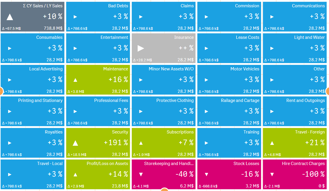
Let’s step through installing and using the Qlik Sense visualization extension that allowed me to easily create the chart pictured here.
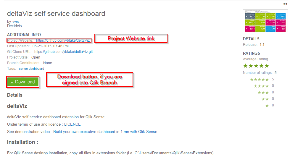
Step 1 – Download Extension from Qlik Branch
I will be installing the “deltaViz self service dashboard,” located at http://branch.qlik.com/projects/showthread.php?331-deltaViz-self-service-dashboard.
There are two ways to download this extension. If you sign in to Qlik Branch, a download button will be visible on the extension’s Qlik Branch page. Simply click it to start the download. You can also visit the project website, which, in this case, is a Github repo, and click the “Download ZIP” button.
Step 2a – Installing Extension into Qlik Sense Server
Now that the extension has been downloaded, it needs to be installed into Qlik Sense. Go to your QMC and, in the navigation menu on the left, under “Manage Resources,” click “Extensions.” Then, in the action bar at the bottom of the screen, click “Import.” Click “Choose File” in the popup and navigate to the folder that was downloaded in step 1, select it, then click “Import.”
Step 2b – Installing Extension into Qlik Sense Desktop
Find the .zip file that was downloaded, and unzip it. Open the unzipped folder to find another folder inside. Copy that folder and navigate to documents/qlik/sense/extensions and paste the folder there.
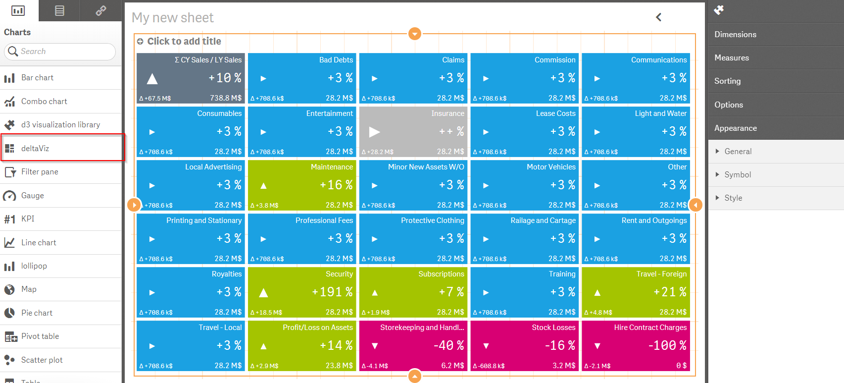
Step 3 – Using the Extension
Open Qlik Sense Desktop, and open the “Executive Dashboard” demo app that comes preinstalled with all Qlik Sense Desktop installations. Create a new sheet, open it, and click edit. A new chart titled “deltaViz” should now be in the list of charts on the left. Drag the “deltaViz” chart onto the sheet. Add the dimension “Account”, add the measure “CY Sales” as the first measure, and add the measure “LY Sales” as the last measure. You should now see the extension visualization!
If you’re seeing something similar to this, then it’s working! Check out Qlik Branch for more cool visualization extensions!
To find the Qlik Sense visualization extensions available on Qlik Branch, navigate to http://branch.qlik.com/, click on “Browse Projects,” and then in the side navigation click “Visualization Extensions” under “Qlik Sense Projects,” or you can navigate directly to http://branch.qlik.com/projects/forumdisplay.php?22-Visualization-Extensions.
You must be a registered user to add a comment. If you've already registered, sign in. Otherwise, register and sign in.