Unlock a world of possibilities! Login now and discover the exclusive benefits awaiting you.
- Qlik Community
- :
- Blogs
- :
- Technical
- :
- Design
- :
- Monitor Visualizations in the Cloud Hub
- Subscribe to RSS Feed
- Mark as New
- Mark as Read
- Bookmark
- Subscribe
- Printer Friendly Page
- Report Inappropriate Content
Did you know that you can monitor visualizations in the cloud hub? Visualizations from sheets in an app and from Insight Advisor can be selected for monitoring. Once selected, these visualizations will appear in the cloud hub in the Your charts section on the Home page and under Charts on the Explore page. Charts can be saved with or without selections and are refreshed every time the source app reloads. Let’s look at how it is done.
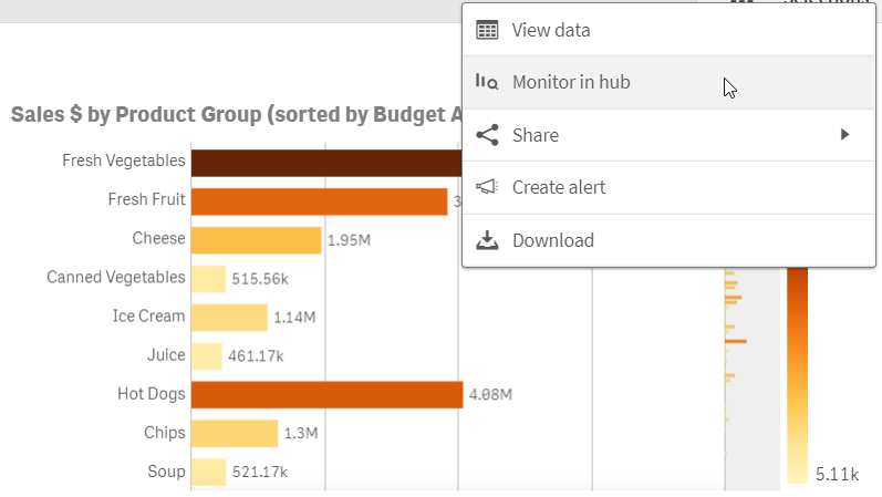
In the image below, the bar chart is on a sheet in my app. Right click on the chart and then click on the eclipse (…) to see the Monitor in hub option displayed below. In the Insight Advisor, the eclipse is in the top right of the chart. Any selections applied to the chart will be saved and applied to the chart that you are monitoring.
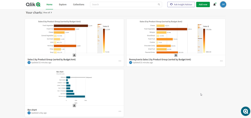
What is nice about this is you can keep an eye on a specific chart without having to open the app and navigate to the visualization. The latest reloaded version of the chart is always the one that is visible in your cloud hub as seen below.
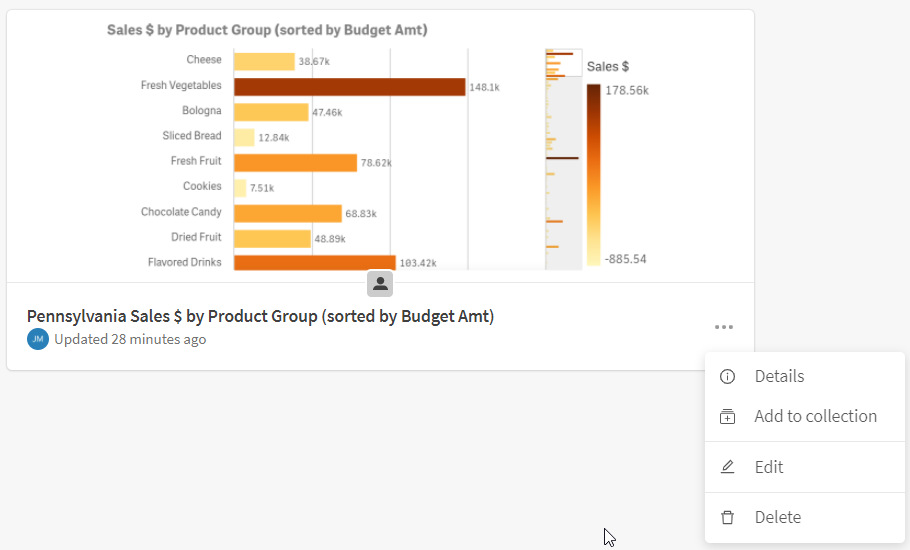
If you want to look at the chart in the app, that is easy to do. When you hover over the chart, there are 2 options: View chart and View in app. View chart will open the latest reloaded version of the chart. Selections cannot be made from here, but they can be made if View in the app is selected. View in the app will open the chart in the app or in Insight Advisor depending on where the source chart was selected. From Home or Explore, you can also click on the eclipse in the lower right of the chart to:
- See details about the chart such as the reload history
- Add the chart to a collection
- Edit some properties of the chart
- Delete the chart from monitoring
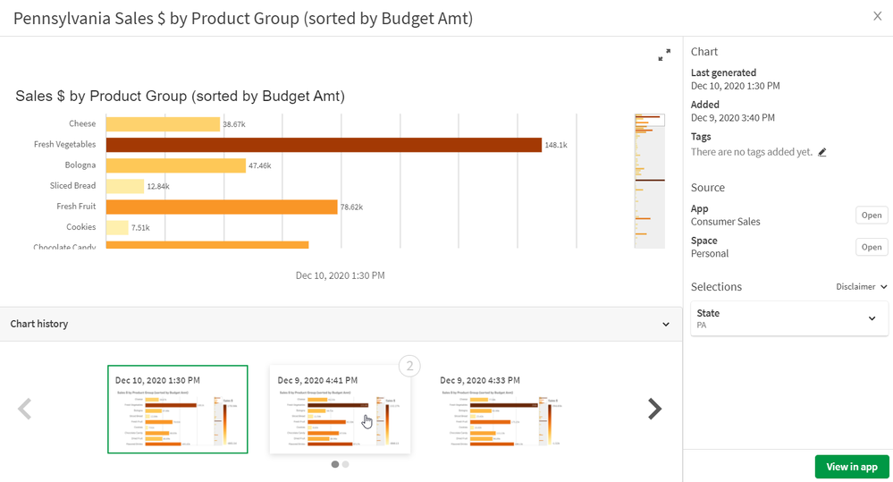
Another nice feature is you can compare versions of the chart. To do this, select the View chart option. From here, you can not only see the latest version of the chart you are monitoring but you can view previous versions of the chart. You can also compare 2 versions of the chart. When you hover over a chart in the Chart history section that is not selected, you will see a 1 and/or 2 in the right top corner of the chart. Selecting 1 will move the chart to the left side of the selected chart for comparison. Selecting 2 will move the chart to the right side of the selected chart for comparison. In the image below, the latest reloaded chart is selected and when I hover over the previous chart, I can see the 2 in the upper right that I can select if I want to compare it to the selected visualization.
Monitoring your charts in your personal space in the cloud hub gives you a new level of flexibility and allows you to see what visualizations are important to you quickly with options to explore them further, if needed. Check out Michael Tarallo's Qlik Sense in 60 - Chart Monitoring video to quickly see how it is done and see Qlik Help for more information on monitoring your visualizations in the cloud hub.
Thanks!
You must be a registered user to add a comment. If you've already registered, sign in. Otherwise, register and sign in.


