Unlock a world of possibilities! Login now and discover the exclusive benefits awaiting you.
- Qlik Community
- :
- All Forums
- :
- GeoAnalytics
- :
- Missing data on chart layer
- Subscribe to RSS Feed
- Mark Topic as New
- Mark Topic as Read
- Float this Topic for Current User
- Bookmark
- Subscribe
- Mute
- Printer Friendly Page
- Mark as New
- Bookmark
- Subscribe
- Mute
- Subscribe to RSS Feed
- Permalink
- Report Inappropriate Content
Missing data on chart layer
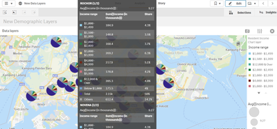
I am trying to plot income distribution island-wide by planning area. I have about 500 data points which should appear on the chart layer plotted on the map, however, many data points are missing. The geodata file containing latitude and longitude of the planning areas are fine as I am able to plot all planning areas as an area layer. As seen in the screenshot attached above, many planning areas do not have income distribution pie charts shown in their locations. The raw data imported does have data points for all planning areas.
Additionally, it would be good if I can present a legend after grouping the income bandings and colour-coding them. I understand that colour by expression will allow me to do the colour-coding but I can't seem to find a way to include a legend that is custom made.
Kindly help with how I can solve this issue.
- Subscribe by Topic:
-
General Question
-
GeoAnalytics
-
GeoOperations
-
Qlik Sense
-
QlikView
- Mark as New
- Bookmark
- Subscribe
- Mute
- Subscribe to RSS Feed
- Permalink
- Report Inappropriate Content
If many points are missing data for the charts, I recommend having two layers, one point plus a chart layer.
For complex coloring I recommend to create a dimension that holds the classification and use a bar chart or similar to serve as a legend.
For inspiration see classcoloring.qvf https://community.qlik.com/t5/Qlik-Sense-Documents/Top-10-QGA-tricks-Qonnections-2019/ta-p/1581145
Thanks,
Patric
