Unlock a world of possibilities! Login now and discover the exclusive benefits awaiting you.
- Qlik Community
- :
- Forums
- :
- Groups
- :
- Industry and Topics
- :
- Healthcare
- :
- Visualizing Paths and Flow with Sankey Diagrams
- Subscribe to RSS Feed
- Mark Topic as New
- Mark Topic as Read
- Float this Topic for Current User
- Bookmark
- Subscribe
- Mute
- Printer Friendly Page
- Feature this Topic
- Mark as New
- Bookmark
- Subscribe
- Mute
- Subscribe to RSS Feed
- Permalink
- Report Inappropriate Content
Visualizing Paths and Flow with Sankey Diagrams
Sankey diagrams are a specific type of flow diagram, in which the width of the paths represent some quantity. These multidimensional visualizations help you to see flow and discover category relationships with a different perspective. If you were to ask me what my favorite visualization was, I'd most likely say: "The Sankey!"
Sankey diagrams show metric flows and category relationships. You can use a Sankey diagram to visualize relationship density and trends.

Use Cases for the Sankey Diagram
Use a Sankey diagram to visualize activity patterns such as:
- Flow: Patient admission and visit flow through your health system - where are patients coming from and where do they have encounters without our facilities and offices?
- Flow: Patient web activity on your patient portal - where are patients looking for information and where do they end up?
- Flow: Longitudinal risk scores for multiple visits - how do risk scores change with subsequent visits?
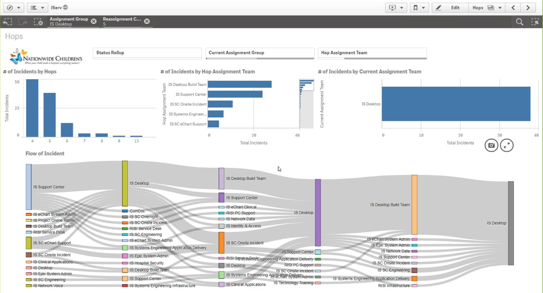
- Flow: ServiceNow ticket handoffs and SLA compliance (showcased by Nationwide Children's in Nov 2017) - which requests or departments pass tickets back and forth perhaps too much?
- Flow and Relationships: Care Pathways showing outcomes metric by various treatments or protocols - do patients receiving X have better outcomes than patients on Y?
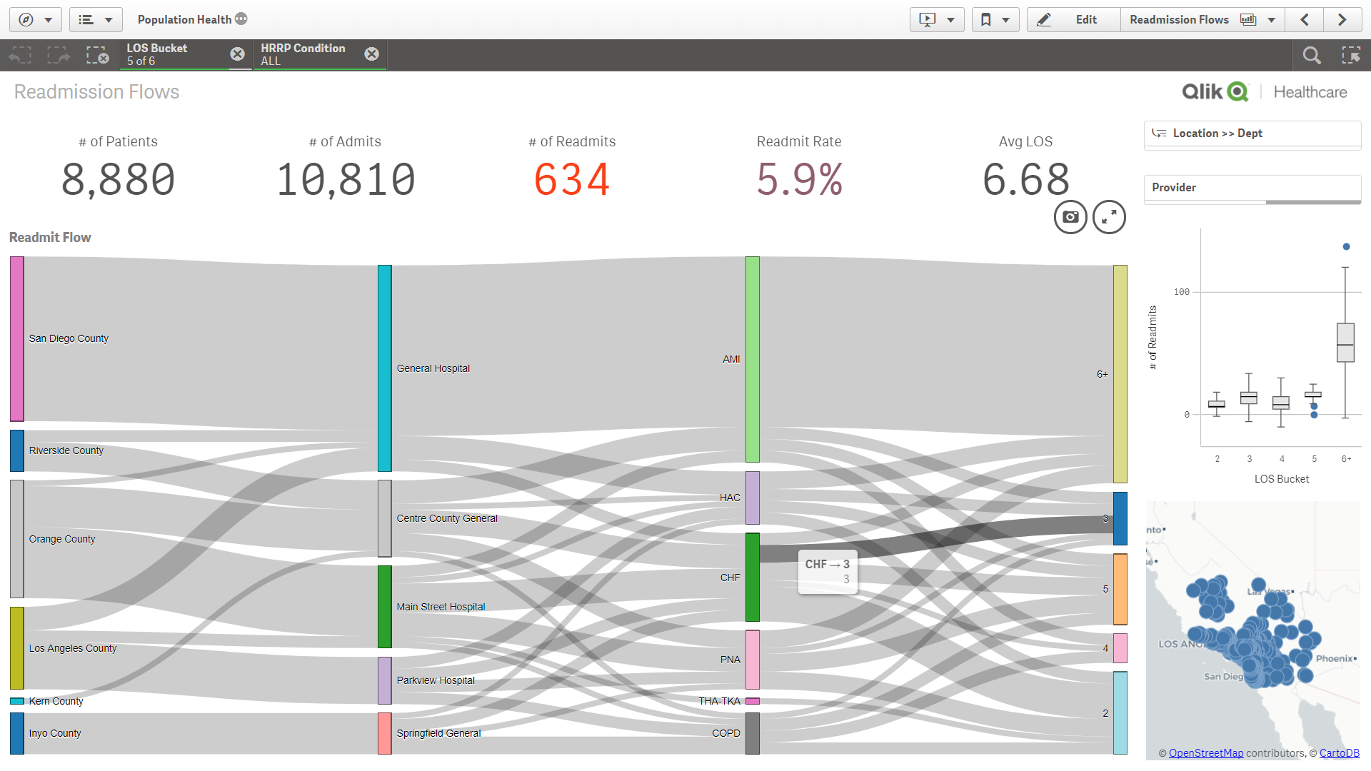
- Relationships: readmissions by a variety of dimensions like county, hospital, condition, complexity, comorbidities, outcomes
- Relationships: Adherence by a variety of demographic and SDoH dimensions like sex, age, race, ethnicity, smoking status, language, support network, community, etc.
- What else have you seen or envision to be useful with a sankey? Please leave a comment here.
Data Requirements
To build a Sankey diagram, you need to have data that includes source and target categories (dimensions) and a metric that you are tracking between them. Luckily, with the Sankey diagrams, these can be completely different types of dimensions and hierarchies, or they can be source and (multiple) target(s) to visualize paths.
Think about it like this: you have one metric/measure of interest (like volume) and multiple dimensions to look at. In contrast to a scatter plot where you have one dimension and multiple metrics/measures.
How to Build/Download a Sankey Diagram
Qlik Sense
- Sankey Diagram for Qlik Sense - http://branch.qlik.com/#!/project/568aa0b06ed0f0f47a89d7f2
- Colorable Sankey - http://branch.qlik.com/#!/project/59f895c77b3744420b107829
QlikView
- QlikView Sankey Improved - http://branch.qlik.com/#!/project/57fce146e41f9c61570e6521
Examples


- « Previous Replies
-
- 1
- 2
- Next Replies »
- Mark as New
- Bookmark
- Subscribe
- Mute
- Subscribe to RSS Feed
- Permalink
- Report Inappropriate Content
Fixed level Sankey diagrams are a very limited use case. Another approach is using a graph model to feed in data to a Sankey. Amount and position of levels are just created out of the graph data. It would also possible to show looping flows. Here is a popular example of this in my graph based Qlik Sense Sankey extension:

But this needs a deeper understanding and a different data preparation where each record or aggregation is one flow. Let me know if someone needs solutions like this.
- Mark as New
- Bookmark
- Subscribe
- Mute
- Subscribe to RSS Feed
- Permalink
- Report Inappropriate Content
Hi Ralf,
I agree with you about the limited use cases! I've got a use case similar to the sankey diagram you attached I.e. each flow in the sankey does not have a fixed number of levels. Some of the flows might stop after 2 or 3 levels and others could have 6 levels.
Would your proposed solution manage that? Have you an example you could share?
thanks
Ash
- Mark as New
- Bookmark
- Subscribe
- Mute
- Subscribe to RSS Feed
- Permalink
- Report Inappropriate Content
Hi Ashley,
this example shown above is a work in progress Sense app and extension using graph data as input. Unfortunately, it fails when the graphs getting more complex since it loops forever. Contact me directly if you want to try it:
Best,
Ralf
- Mark as New
- Bookmark
- Subscribe
- Mute
- Subscribe to RSS Feed
- Permalink
- Report Inappropriate Content
Hi Ralf,
Thanks for your quick response. Unfortunately I'm working with a huge data set and I think the looping issue could cause unwauted performance issues in the app.
I'm going to consider other ways in which I can visualise the data in this instance.
thanks again for your help.
Regards
Ash
- Mark as New
- Bookmark
- Subscribe
- Mute
- Subscribe to RSS Feed
- Permalink
- Report Inappropriate Content
Hi Ashley,
with complexity I meant amount of nodes and connectedness. The size of the underlaying data is not an issue at all.
Best,
Ralf
- Mark as New
- Bookmark
- Subscribe
- Mute
- Subscribe to RSS Feed
- Permalink
- Report Inappropriate Content
Hi all,
Sorry for bothering, how did you manage to have SenseSankey running in Qlik Sense (my version is February 2018).
I get either the
Incomplete Visualization error with http://branch.qlik.com/#!/project/568aa0b06ed0f0f47a89d7f2
or "calculation page is too large" with:
http://branch.qlik.com/#!/project/59f895c77b3744420b107829
The chart is very simple with one dimension and one measure and only 40 entries.
BTW, as a healthcare data scientist I am totally into using Sankey visualizations for life-long healthcare patterns discovery. In my case I am using the nPath function on Teradata with (hopefully ) Snkey graphics in Qlik Sense.
Radu
- Mark as New
- Bookmark
- Subscribe
- Mute
- Subscribe to RSS Feed
- Permalink
- Report Inappropriate Content
Hi Radu,
the Sankey needs at least 2 Dimensions. Please open another discussion thread if you have a problem using it.
- Ralf
- Mark as New
- Bookmark
- Subscribe
- Mute
- Subscribe to RSS Feed
- Permalink
- Report Inappropriate Content
Hi, I am looking for something like this. I have records which go through different status and sometimes skip some. I am currently making my sankey by feeding the excel sheet into it. Each record has a many status. I want to show its flow from one to other and skip from one to other in case it doesnt visit some status in the sequence.
Please provide help how to achieve this
- Mark as New
- Bookmark
- Subscribe
- Mute
- Subscribe to RSS Feed
- Permalink
- Report Inappropriate Content
Hello Hina,
maybe you should open another thread and upload some sample data to get helped.
- Rslf
- « Previous Replies
-
- 1
- 2
- Next Replies »