Unlock a world of possibilities! Login now and discover the exclusive benefits awaiting you.
- Qlik Community
- :
- Support
- :
- Support
- :
- Knowledge
- :
- Member Articles
- :
- How to Create a PixelPerfect Chart with Two Differ...
- Move Document
- Delete Document
- Subscribe to RSS Feed
- Mark as New
- Mark as Read
- Bookmark
- Subscribe
- Printer Friendly Page
- Report Inappropriate Content
How to Create a PixelPerfect Chart with Two Different Scales for the Y Axis
- Move Document
- Delete Document
- Mark as New
- Bookmark
- Subscribe
- Mute
- Subscribe to RSS Feed
- Permalink
- Report Inappropriate Content
How to Create a PixelPerfect Chart with Two Different Scales for the Y Axis
Description: Learn how to display two measures with different units on the Y axis on the same chart. In this tutorial we'll create a chart to display category sales as a currency on the left scale and as a quantity on the right scale.
We suggest completing the tutorials "How to Create PixelPerfect Charts" and "How to Create a Well Formatted PixelPerfect Chart" before continuing.
Create a new PixelPerfect template and add a data source to the QlikView Chart
- Create a new PixelPerfect report. Refer to How to Create a Simple PixelPerfect Report
- Set "PixelPerfect Two Scales Chart" as report name
- Open a new template in the editor
- From the connection SalesDemo, add the CH305 into the Tables node
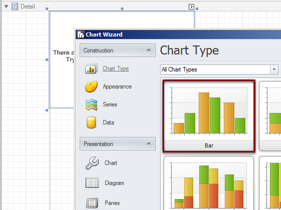
Create a new chart
- Drag the bottom border down to increase the report area
- Drag and drop a chart object from the Tool Box on the right side into the template Detail area to create a new chart
- The Chart Wizard will be opened
- Select "Bar" chart and click on Next
- On the Appearance window click on Next: we'll use the default settings
Set the Data Series Names
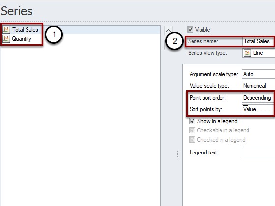
- Set the name "Total Sales" for Series 1
- Set the name "Quantity" for Series 2
- With "Total Sales" selected, set "Point sort order" to Descending and "Sort points by" to Value. This will arrange the data by category from the highest "Total Sales" to the lowest
- Click on Next
Total Sales Series Binding
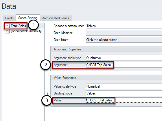
- Select the "Total Sales" series
- Open the "Argument" drop-down menu then double click on the "Top Sales" column from the CH305
- Open the "Value" drop-down menu and select the column "Total Sales". This binds the "Total Sales" series with the QlikView data
Quantity Series Binding
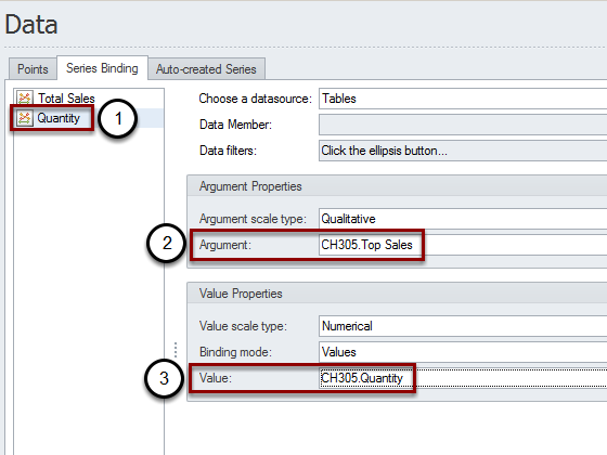
- Select the "Quantity" series
- In the "Argument" menu select the column "Top Sales"
- Set the column "Quantity" in the "Value" menu. The "(incompatible)" text disappears
- Click on Next
- Click on Next again to leave the default Chart settings
Create a Secondary Y-Axis
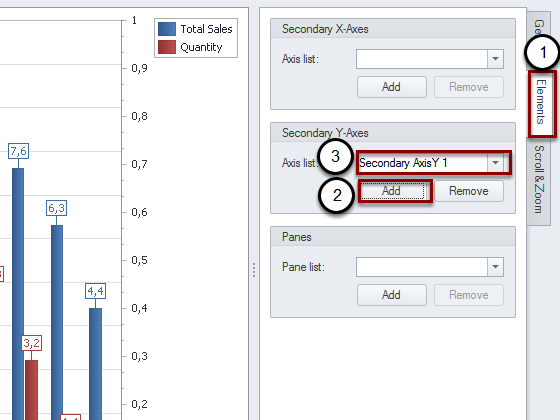
- In the "Diagram" window select the "Elements" tab
- Click on "Add" in the "Secondary Y-Axis" area. This is a critical step for this tutorial
- The "Secondary AxisY 1" appears
- Click on Next
- Click on Next again to leave the default "Panes" options
Set the Primary X-Axis Options
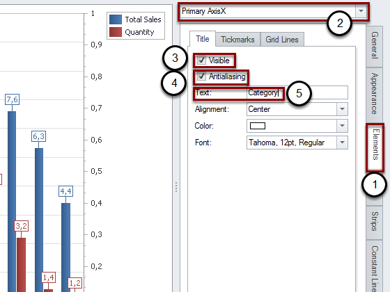
- In the "Axis" window, activate the "Elements" tab
- Be sure to use the "Primary AxisX"
- Activate the flag "Visible"
- Activate the flag "Antialiasing"
- Type "Category" into the Text box
Set the Primary Y-Axis Options
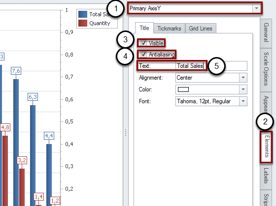
- Activate the "Primary AxisY" in the top drop-down menu
- Open the "Elements" tab
- Check "Visible"
- Check "Antialiasing"
- Type "Total Sales" in the Text box
Set the Primary Y-Axis Number Format
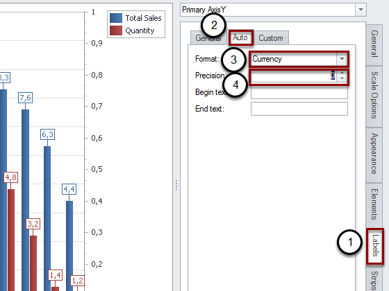
- Activate the "Labels" tab
- Select the "Auto" tab
- Set the format to "Currency"
- Set the "precision" to 0
Set the "Secondary AxisY 1" Options
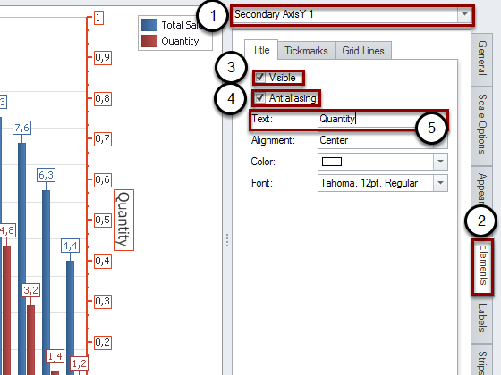
- Activate the "Secondary AxisY 1"
- Open the "Elements" tab
- Check "Visible"
- Check "Antialiasing"
- Type "Quantity" in the Text box
Set the "Secondary Axis Y 1" Number Format
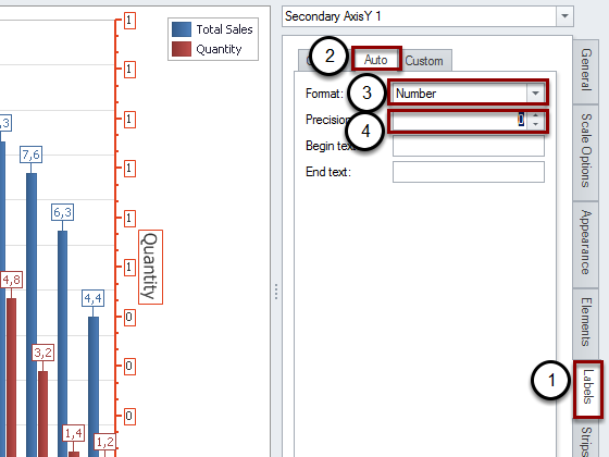
- Open the "Labels" tab
- Select the "Auto" tab
- Change the Format to "Number"
- Set the "Precision" to 0
Connect "Total Sales" series with "Primary AxisY"
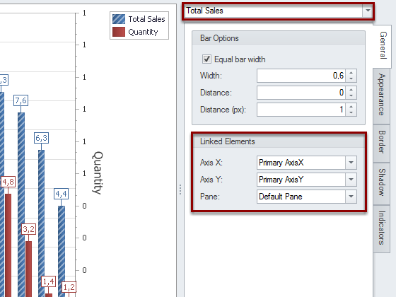
In the "Series View" be sure to use the "Total Sales" series and leave the default "Linked Elements". This will connect the "Total Sales" series with the "Primary AxisY".
Connect "Quantity" series with "Secondary AxisY 1"
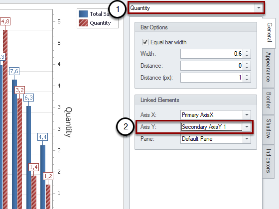
- Switch to "Quantity" by using the drop-down menu
- In "Axis Y" select "Secondary AxisY 1". This will connect the "Quantity" series to the "Secondary AxisY 1"
Remove the "Point Labels" (Values)
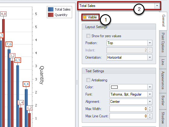
- Uncheck "Visible". This will remove the "Point Labels", or the values you see over the bars
- Select "Quantity" from the "Total Sales" drop-down menu
- Uncheck "Visible" again to remove them for both data series
Increase chart size
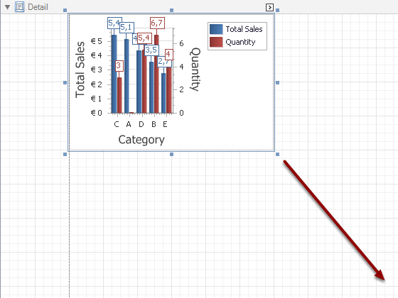
By using the mouse, select the bottom right corner and increase the chart size.
Preview and Save
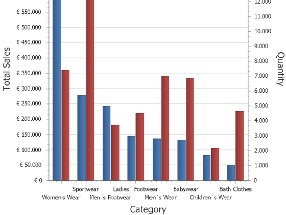
Preview and Save the report as usual.